History History 5 min read

Marketing experts!

Can you see the arrow in the logo? 12 American brands' logos decoded!

Image: KelvinStuttard

Logos are everywhere: on billboards, coffee cups, your favorite gadgets—you name it! But how much attention do we really pay to the stories behind them? For example, did you know about the hidden arrow in the FedEx logo? And what about Tesla—is it just a T, or is there more to it? Big brands, big logos, big backstories —of course! Let’s take a fun dive into 12 iconic American brand logos and the hidden tales they tell.

1
Disney: A signature of magic

Image: Gui Avelar

Some logos inspire happiness at first glance, don’t you think? Walt Disney’s logo is a perfect example for us. It’s playful and inviting, and that’s because it’s modeled after Walt Disney’s very own signature, or at least an artistic version of it.

The truth is that Walt’s actual handwriting looked pretty different from the logo we know today because he changed his signature frequently, making it nearly impossible to determine if this version was ever truly his. In any case, it was very successful, and if you ask us, this logo screams "happily ever after."

2
McDonald’s: Golden arches or hidden symbol?

Image: Janet Ganbold

The moment you see a golden "M," your mouth starts watering, doesn’t it? However, the famous Golden Arches weren’t always part of McDonald’s logo history.

Back in the 1950s, they were part of the restaurant’s architecture, we mean actual arches on either side of the building!

When designing a logo, the company leaned into that imagery to create something unforgettable. Well, they definitely did it! And we’re lovin’ it!

3
Coca-Cola: Scripted for success

Image: Efekan Akyüz

That classic Coca-Cola logo has remained surprisingly consistent since 1887. The secret? A font called Spencerian Script, which was highly fashionable back in the late 19th century.

The smooth, flowing letters give it a friendly, approachable feel, it’s like an invitation to "have a Coke and a smile."

Over the years, the brand played with design elements (remember the old glass bottles?), but the logo’s handwritten charm never wavered. The old-school way truly is the best way in some cases.

4
Dove: A symbol of softness

Image: Akshay Bandre

Some logos are so powerful, that you can almost taste them. In this case, you can smell and feel it at the same time. Have you ever noticed the graceful bird on Dove products? That dove isn’t just for show, it represents peace, gentleness, and care , which is exactly what the brand aims to evoke.

When Dove first launched in 1955, its messaging was all about moisturizing and being kind to your skin. The logo, paired with the brand’s soothing colors, reinforces that sense of softness. It’s one of those designs that just feels good, even before you try the products.

5
Amazon: The smile that points the way

Image: Christian Wiediger

The story behind the name is quite fascinating, but let’s focus on the logo. Amazon’s logo isn’t just a smile—it’s a smile with a purpose. Look closely, and you’ll notice the arrow stretches from "A" to "Z," symbolizing the company’s goal to offer everything you could ever need.

And that curved arrow? It’s designed to look like a grin, giving the brand a friendly, customer-first vibe. With a logo this clever, it’s no surprise they’ve grown into an online shopping powerhouse. This is the kind of logo we like—what about you?

6
Google: The colors of curiosity

Image: sarah b

At first glance, one might think Google just put together the letters, chose random colors, and launched the site. But that’s definitely not the case—this logo is packed with meaning.

To begin with, they are not random colors, they are primary colors, chosen to represent creativity and approachability .

As for the unexpected green "L," it’s a nod to the idea that Google likes to break the rules (in a good way, of course). Over the years, the company has refreshed the logo’s font and shading, but the vibe remains the same. And let’s not forget about the festive Doodles—they’re genius!

7
Starbucks: From the sea to your cup

Image: Athar Khan

That green mermaid on your Starbucks cup? She’s actually a two-tailed siren, inspired by an old Norse woodcut. Why a siren, you may ask? Well, the brand wanted to evoke the allure of coffee as something irresistible —like a siren’s call.

Over time, the logo has evolved, losing the "Starbucks Coffee" text to let the siren shine on her own. Curious enough, the first design included the name of the company on the outer part of the circle, but they decided to eliminate that and let the siren do all the luring work on her own!

8
FedEx: The arrow you didn’t see

Image: Jan Rosolino

FedEx has one of the sneakiest logos in the business world. Between the "E" and the "X," there’s a hidden arrow that represents speed and precision . And once you see it, you can’t unsee it!

This wasn’t the original version, though. Designed in 1994, the logo is a masterclass in subtlety and clever branding, much like Amazon’s. It’s a perfect fit for a company that prides itself on delivering packages quickly and efficiently.

9
Domino’s: Three dots, infinite pizza

Image: Miroslav Denkov

Speaking of logos you can taste, right? Domino’s logo features three dots, which represent the first three locations of the pizza chain .

Originally, the company planned to add a new dot for every store they opened. Can you imagine if they had kept that idea? They quickly realized that wouldn’t work with their explosive growth.

Paired with the iconic red and blue colors, the logo is as comforting as a fresh box of pizza. And let’s be real—who doesn’t love their pizza?

10
Tesla: An electric secret

Image: Tesla Fans Schweiz

Tesla’s sleek, futuristic logo isn’t just a fancy "T"; it’s actually a nod to the company’s cutting-edge tech. The "T" is designed to resemble a cross-section of an electric motor, tying into Tesla’s mission of revolutionizing transportation .

Pair that with its clean lines and modern vibe, and you’ll see that the logo feels as innovative as the cars themselves. It’s a perfect example of branding that matches the product: bold, forward-thinking, and undeniably cool. What do you think?

11
Levi’s: A stitch in time

Image: Mnz

Few pieces of clothing are as iconic as a pair of Levi’s, right? That’s because both the item and the logo are equally simple, bold, and instantly recognizable .

The classic red tab is the result of eight redesigns. The first version of the logo included two horses pulling in opposite directions of a pair of jeans, trying to rip them—and failing, of course! But that was just the beginning.

The logo we know today was introduced by the same designer who worked on Coca-Cola’s script and the inspiration was the stitching on the back pocket of the jeans. The rest, as they say, is comfortable and durable history!

12
Pepsi: A logo full of energy

Image: Ja San Miguel

This article comes to an end with a classic brand. Pepsi’s logo has gone through dozens of iterations, but the current design—a red, white, and blue globe—is packed with meaning.

The wavy lines represent energy and dynamism, while the patriotic colors nod to its American roots, naturally. And if you were doubtful that it represents our country, you can read the 27-page redesign manifesto from 2008, which reportedly cost millions and came with a full explanation of its symbolism!
Geography Geography 4 min read

Behind tall faces

Mount Rushmore hides many secrets. Did you know all of these?

Image: Jake Leonard

What famous woman’s face almost became the fifth face on Mount Rushmore? Did the sculptor Gutzon Borglum really intend to just carve out the heads? Why is the mount named that, and not Borglum? The answers to these questions are some lesser-known facts about one of the most famous landmarks and sights in our country. Let’s dive into these stories!

1
The original plan included full-body figures

Image: Thomas Shockey

Mount Rushmore was supposed to be even more colossal than it already is. Sculptor Gutzon Borglum envisioned the four presidents carved from the waist up .

He even made plaster models showing Abraham Lincoln's coat folds and Teddy Roosevelt’s hand clutching his lapel. But as costs went up, Congress said: "heads only, please."

2
Charles Rushmore was just a curious New Yorker

Image: Maarten van den Heuvel

Back in 1925, when the mount was about to be carved into a monument, Charles Rushmore wrote a letter explaining why the peak bore his name. He recalled that in the 1880s he was a young New Yorker working in the area, and fell fond of that particular granite peak .

When he asked the locals about it, they informed him that it had no name, but that if he wished so, they would just start calling it Rushmore Peak, or Mount Rushmore, or the likes. Years later, that very name had been inscribed in the public domain to designate the peak.

3
Yes, there’s a hidden room behind Lincoln’s head

Image: Laura Nyhuis

Behind Abraham Lincoln’s hairline lies a hidden chamber, part of Borglum’s lofty idea for a "Hall of Records." This room was meant to house foundational American documents like the Constitution or the Declaration of Independence.

Instead of that, in 1998, a titanium box was placed inside, filled with copies of important documents and biographies, as a time capsule to preserve the treasure of knowledge for future generations.

4
Thomas Jefferson was moved

Image: Dave Baraloto

Jefferson was originally supposed to go to Washington’s right, but after 18 months of chiseling , the granite betrayed them. Cracks and flaws made the site unworkable.

Borglum made the painful decision to blast Jefferson’s half-formed face clean off and start anew on Washington’s left.

5
The mountain was almost a monument to western heroes

Image: Timberly Hawkins

Before presidents took over, the mountain was pitched as a giant tribute to the Wild West . South Dakota historian Doane Robinson wanted to see frontier legends like Lewis & Clark carved into the Black Hills.

But when Borglum came aboard, he had a grander (and more politically bankable) idea: four presidents to symbolize national unity and expansion.

6
A woman’s face was almost added

Image: Tom Fournier

In the 1930s, there was serious talk of honoring Susan B. Anthony alongside the Founding Fathers, as a nod to the women’s suffrage movement.

Borglum wasn’t opposed to the idea, but Congress quickly nixed it, stating that only U.S. presidents could be included.

7
The workers were mostly local miners and loggers

Image: Pixabay

They were neither sculptors nor artists. Most of the workforce came from nearby Keystone, South Dakota: miners, loggers, and hard-up laborers looking for work during the Great Depression.

Borglum trained them himself. There were no safety harnesses, and yet, remarkably, no one died on the job.

8
Dynamite did 90% of the work

Image: Alexander Paramonov

To carve the faces of Washington, Jefferson, Roosevelt, and Lincoln, workers used carefully timed dynamite blasts to remove over 450,000 tons of rock. They got so precise, they could blast within inches of where the final surface would be.

The last details, like wrinkles, pupils, or Roosevelt’s glasses, were done with jackhammers and chisels.

9
The noses are disproportionate

Image: Dudubangbang Travel

Standing in front of the mountain, the faces seem alright. But that’s a trick of perspective. Each presidential nose is a whopping 20 feet long .

If the sculptures had included full bodies as planned, each figure would have stood 465 feet tall. That’s taller than the Statue of Liberty and most downtown skyscrapers.

10
Teddy Roosevelt was the most controversial pick

Image: Dudubangbang Travel

Washington, of course. Jefferson, made sense. Lincoln, sure. And Teddy? Some critics raised their eyebrows at Borglum’s fourth choice. Roosevelt had only recently passed away in 1919, and many questioned whether he'd stood the test of time.

But Borglum defended the decision Roosevelt’s role in breaking up monopolies, conserving national parks, and engineering the Panama Canal. Plus, Borglum had met him personally and was a fan.

11
It was supposed to have inscriptions

Image: Dan Pick

Borglum had grander plans than just four giant heads. He wanted to carve a massive inscription next to them, a timeline of America’s most important milestones , chiseled straight into the mountain. In time, the idea was scrapped for practical and aesthetic reasons.

12
The visionary died before completion

Image: Lisa Reichenstein

Gutzon Borglum, the visionary behind it all, didn’t live to see his masterpiece finished. He died in March 1941, just as the construction was reaching its end. His son, Lincoln Borglum (yes, named after that Lincoln), took over the project.

Still, with WWII drawing resources elsewhere, funding was slashed, and Lincoln had to wrap things up quickly . Some features, like Lincoln’s ear, were never fully detailed.

History History 3 min read

Have you experienced any coincidences?

12 incredible coincidences in American history

Image: Library of Congress

A coincidence is a remarkable concurrence of events or circumstances without an apparent causal connection. Most of us experience coincidences regularly, but they tend to be more ordinary—like discovering you’re wearing the same sweater as someone else in the room. The following 12 examples are much more extreme, and some even seem unbelievable, even though they are true. Read on and prepare to be amazed!

1
A Presidential curse

Image: David Everett Strickler

For almost 140 years, U.S. presidents elected in years ending in zero died while in office. It happened to William Henry Harrison (1840), Abraham Lincoln (1860), James A. Garfield (1880), William McKinley (1900), Warren G. Harding (1920), Franklin D. Roosevelt (1940), and John F. Kennedy in 1960 . Ronald Reagan, elected in 1980 , broke the curse by surviving an assassination attempt.

2
Mark Twain and Halley’s Comet

Image: Justin Wolff

In the year Mark Twain was born, 1835, Halley’s Comet passed by Earth. The great writer famously predicted he’d "go out with it" as well . Indeed, he passed away in 1910, the next time the comet appeared.

3
Jefferson and Adams

Image: iStrfry , Marcus

A patriotic yet somber coincidence, indeed. John Adams and Thomas Jefferson, the second and third U.S. presidents, both died on July 4, 1826 —exactly 50 years after the signing of the Declaration of Independence.

4
Hoover Dam’s first and last casualties

Image: Ryan Thorpe

The construction of the Hoover Dam was a long and difficult process, claiming over 100 lives. The first person to die was J.G. Tierney , and the last recorded death was his son , Patrick Tierney.

5
Lincoln and Kennedy

Image: Kelli Dougal

Abraham Lincoln and John F. Kennedy were elected 100 years apart (1860 and 1960). Both suffered fatal head wounds and were succeeded by presidents named Johnson. Their assassins each had three names: John Wilkes Booth and Lee Harvey Oswald. Both were assassinated on a Friday while sitting next to their wives at the time that it happened.

6
Charles Francis Coghlan’s last journey

Image: Rhodi Lopez

Actor Charles Francis Coghlan died in Texas in 1899. But his casket was lost at sea during a hurricane. Eight years later, his coffin washed ashore near his birthplace in Prince Edward Island, Canada, more than 3,000 miles away.

7
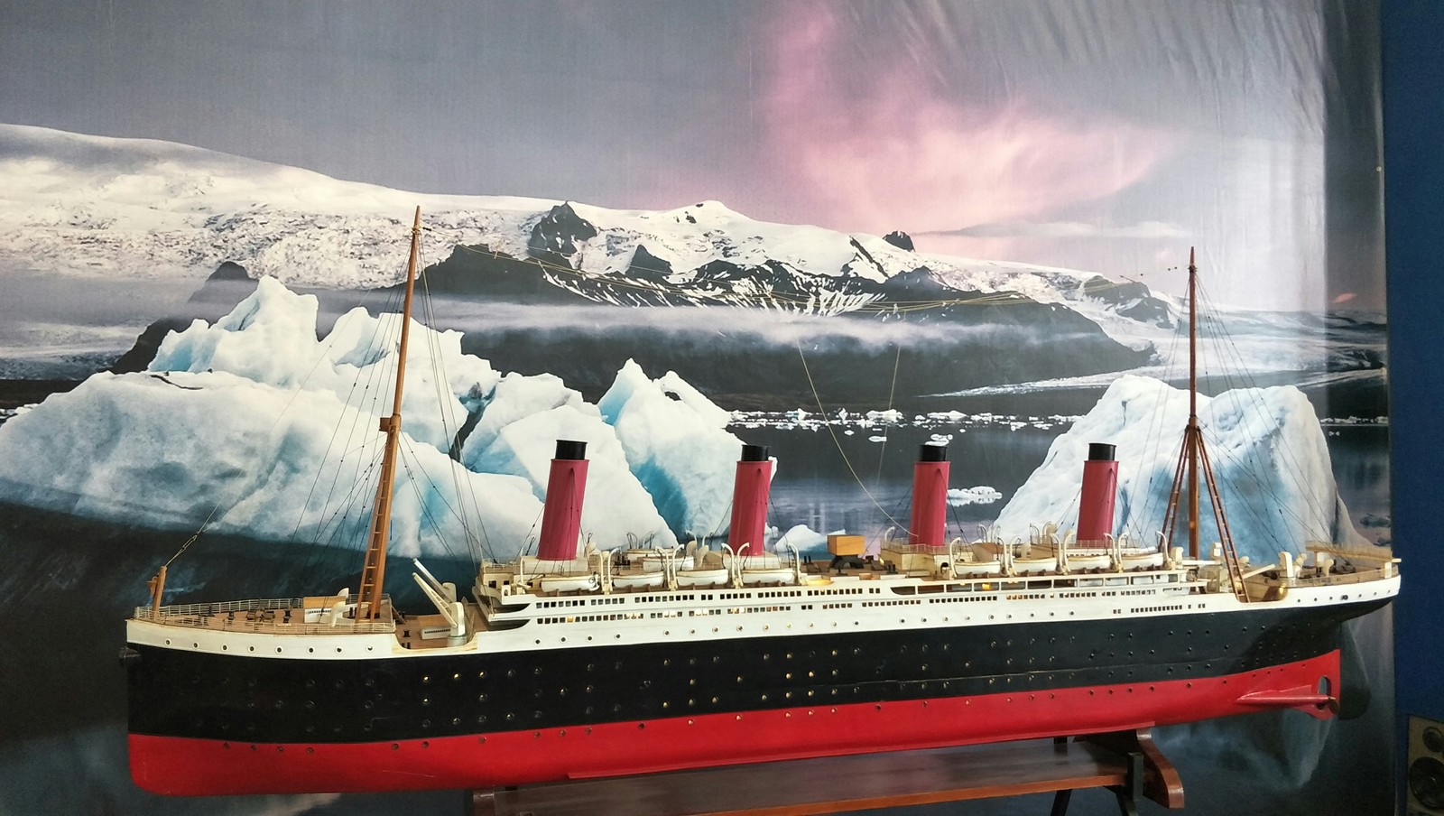
The Titanic coincidence

Image: K. Mitch Hodge

A few years before the Titanic sank, Morgan Robertson wrote a short book called Futility , about a massive "unsinkable" ship called the Titan that hit an iceberg and sank. The tale describes a ship with a similar size and a similar lack of lifeboats to the famous vessel.

8
Dennis the Menace

Image: Mitch Rosen

Two comic strips featuring a character named Dennis the Menace debuted in British and American outlets, respectively, on March 12, 1961—only a few hours apart. However, the two creators did not know each other and had no idea of the other’s work.

9
Jim Lewis and Jim Springer

Image: Vidar Nordli-Mathisen

Identical twin brothers separated at birth , Jim Lewis and Jim Springer, were reunited at age 39 and discovered many coincidences: both married women named Linda , divorced, and then remarried women named Betty. Both had dogs named Toy and drove the same model of car. Both grew up with an adopted brother named Larry and had sons whom they named James Allan.

10
Disney magic

Image: PAN XIAOZHEN

A soon-to-be-married couple, Alex and Donna , were looking through old photos to include in their wedding video. They found one photo of Donna posing on a childhood trip to Disney World in 1980. And in the background, they spotted Alex being pushed in a stroller by his father.

11
Moped meets taxi, twice

Image: Ruslan Bardash

In 1975, 17-year-old Erskine Lawrence Ebbin was struck by a taxi in Bermuda while riding his moped. A year later, his brother Neville , also 17 at the time, was riding the same moped when he was struck by the same taxi —with the same passenger—on the same street.

12
Lightning strike survivor

Image: Felix Mittermeier

Being hit by lightning is an extremely rare occurrence. Park ranger Roy Sullivan was struck not once, but seven times between 1942 and 1977 —and survived them all. The strikes hit him in a fire tower, in his truck, in his yard, while patrolling, and more. His unusual record earned him the nickname "Human Lightning Rod."

Explore more American facts

Choose your favorite category!

General
General

As American as apple pie—the very best America has to offer!

Culture
Culture

Delve into the astounding richness of American lore.

Geography
Geography

Hop in and explore vast and diverse American landscapes.

History
History

Discover the key moments that shaped the United States.