History History 5 min read

Marketing experts!

Can you see the arrow in the logo? 12 American brands' logos decoded!

Image: KelvinStuttard

Logos are everywhere: on billboards, coffee cups, your favorite gadgets—you name it! But how much attention do we really pay to the stories behind them? For example, did you know about the hidden arrow in the FedEx logo? And what about Tesla—is it just a T, or is there more to it? Big brands, big logos, big backstories —of course! Let’s take a fun dive into 12 iconic American brand logos and the hidden tales they tell.

1
Disney: A signature of magic

Image: Gui Avelar

Some logos inspire happiness at first glance, don’t you think? Walt Disney’s logo is a perfect example for us. It’s playful and inviting, and that’s because it’s modeled after Walt Disney’s very own signature, or at least an artistic version of it.

The truth is that Walt’s actual handwriting looked pretty different from the logo we know today because he changed his signature frequently, making it nearly impossible to determine if this version was ever truly his. In any case, it was very successful, and if you ask us, this logo screams "happily ever after."

2
McDonald’s: Golden arches or hidden symbol?

Image: Janet Ganbold

The moment you see a golden "M," your mouth starts watering, doesn’t it? However, the famous Golden Arches weren’t always part of McDonald’s logo history.

Back in the 1950s, they were part of the restaurant’s architecture, we mean actual arches on either side of the building!

When designing a logo, the company leaned into that imagery to create something unforgettable. Well, they definitely did it! And we’re lovin’ it!

3
Coca-Cola: Scripted for success

Image: Efekan Akyüz

That classic Coca-Cola logo has remained surprisingly consistent since 1887. The secret? A font called Spencerian Script, which was highly fashionable back in the late 19th century.

The smooth, flowing letters give it a friendly, approachable feel, it’s like an invitation to "have a Coke and a smile."

Over the years, the brand played with design elements (remember the old glass bottles?), but the logo’s handwritten charm never wavered. The old-school way truly is the best way in some cases.

4
Dove: A symbol of softness

Image: Akshay Bandre

Some logos are so powerful, that you can almost taste them. In this case, you can smell and feel it at the same time. Have you ever noticed the graceful bird on Dove products? That dove isn’t just for show, it represents peace, gentleness, and care , which is exactly what the brand aims to evoke.

When Dove first launched in 1955, its messaging was all about moisturizing and being kind to your skin. The logo, paired with the brand’s soothing colors, reinforces that sense of softness. It’s one of those designs that just feels good, even before you try the products.

5
Amazon: The smile that points the way

Image: Christian Wiediger

The story behind the name is quite fascinating, but let’s focus on the logo. Amazon’s logo isn’t just a smile—it’s a smile with a purpose. Look closely, and you’ll notice the arrow stretches from "A" to "Z," symbolizing the company’s goal to offer everything you could ever need.

And that curved arrow? It’s designed to look like a grin, giving the brand a friendly, customer-first vibe. With a logo this clever, it’s no surprise they’ve grown into an online shopping powerhouse. This is the kind of logo we like—what about you?

6
Google: The colors of curiosity

Image: sarah b

At first glance, one might think Google just put together the letters, chose random colors, and launched the site. But that’s definitely not the case—this logo is packed with meaning.

To begin with, they are not random colors, they are primary colors, chosen to represent creativity and approachability .

As for the unexpected green "L," it’s a nod to the idea that Google likes to break the rules (in a good way, of course). Over the years, the company has refreshed the logo’s font and shading, but the vibe remains the same. And let’s not forget about the festive Doodles—they’re genius!

7
Starbucks: From the sea to your cup

Image: Athar Khan

That green mermaid on your Starbucks cup? She’s actually a two-tailed siren, inspired by an old Norse woodcut. Why a siren, you may ask? Well, the brand wanted to evoke the allure of coffee as something irresistible —like a siren’s call.

Over time, the logo has evolved, losing the "Starbucks Coffee" text to let the siren shine on her own. Curious enough, the first design included the name of the company on the outer part of the circle, but they decided to eliminate that and let the siren do all the luring work on her own!

8
FedEx: The arrow you didn’t see

Image: Jan Rosolino

FedEx has one of the sneakiest logos in the business world. Between the "E" and the "X," there’s a hidden arrow that represents speed and precision . And once you see it, you can’t unsee it!

This wasn’t the original version, though. Designed in 1994, the logo is a masterclass in subtlety and clever branding, much like Amazon’s. It’s a perfect fit for a company that prides itself on delivering packages quickly and efficiently.

9
Domino’s: Three dots, infinite pizza

Image: Miroslav Denkov

Speaking of logos you can taste, right? Domino’s logo features three dots, which represent the first three locations of the pizza chain .

Originally, the company planned to add a new dot for every store they opened. Can you imagine if they had kept that idea? They quickly realized that wouldn’t work with their explosive growth.

Paired with the iconic red and blue colors, the logo is as comforting as a fresh box of pizza. And let’s be real—who doesn’t love their pizza?

10
Tesla: An electric secret

Image: Tesla Fans Schweiz

Tesla’s sleek, futuristic logo isn’t just a fancy "T"; it’s actually a nod to the company’s cutting-edge tech. The "T" is designed to resemble a cross-section of an electric motor, tying into Tesla’s mission of revolutionizing transportation .

Pair that with its clean lines and modern vibe, and you’ll see that the logo feels as innovative as the cars themselves. It’s a perfect example of branding that matches the product: bold, forward-thinking, and undeniably cool. What do you think?

11
Levi’s: A stitch in time

Image: Mnz

Few pieces of clothing are as iconic as a pair of Levi’s, right? That’s because both the item and the logo are equally simple, bold, and instantly recognizable .

The classic red tab is the result of eight redesigns. The first version of the logo included two horses pulling in opposite directions of a pair of jeans, trying to rip them—and failing, of course! But that was just the beginning.

The logo we know today was introduced by the same designer who worked on Coca-Cola’s script and the inspiration was the stitching on the back pocket of the jeans. The rest, as they say, is comfortable and durable history!

12
Pepsi: A logo full of energy

Image: Ja San Miguel

This article comes to an end with a classic brand. Pepsi’s logo has gone through dozens of iterations, but the current design—a red, white, and blue globe—is packed with meaning.

The wavy lines represent energy and dynamism, while the patriotic colors nod to its American roots, naturally. And if you were doubtful that it represents our country, you can read the 27-page redesign manifesto from 2008, which reportedly cost millions and came with a full explanation of its symbolism!
General General 6 min read

Beloved American brands

Why did Kodak and Woolworth's disappear? The real reason

Image: pony rojo, CC BY-SA 2.0, via Wikimedia Commons

Blockbuster, Kodak, Woolworth’s… just hearing those names can bring back many memories, even though the brands have long since gone. T hese weren’t just brands; they were part of our routines, our weekends, and our family vacations. For decades, these companies seemed unstoppable. Then, they disappeared. So what happened? Here’s the story behind 10 iconic American brands that once stood at the top, and the real reasons they faded away.

1
Blockbuster

Image: RegionalQueenslander, CC BY-SA 4.0, via Wikimedia Commons

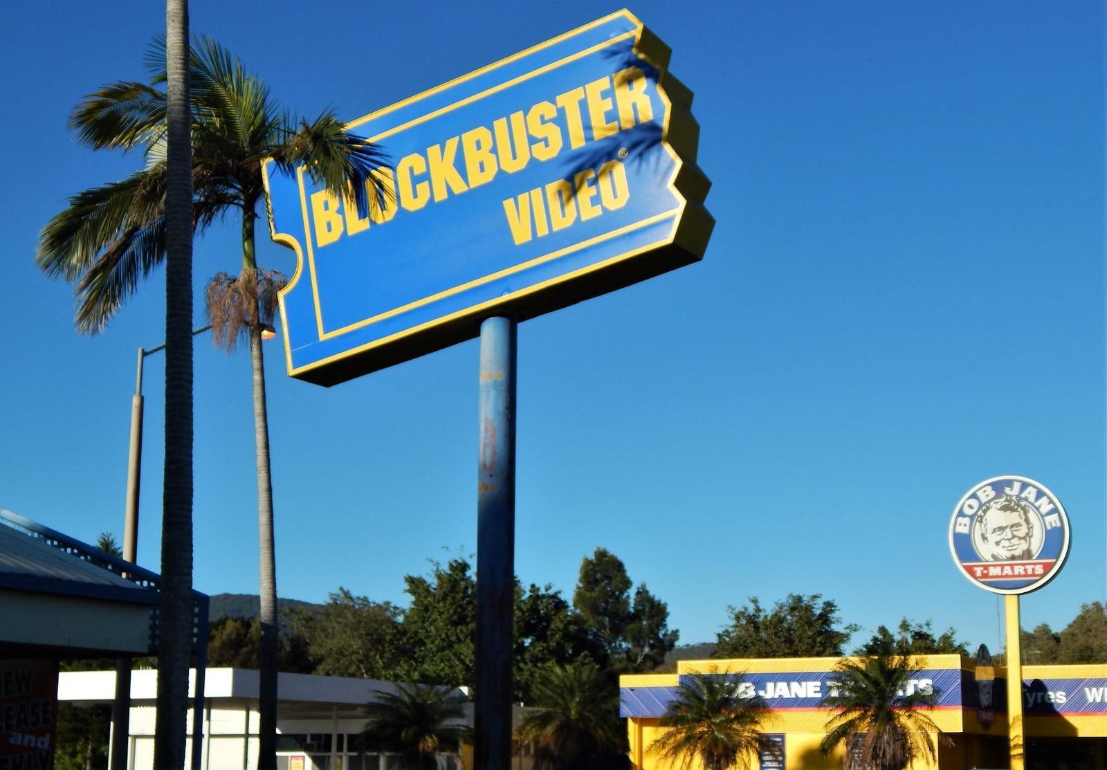
During the 1980s and 1990s, Friday night often meant one thing for American families: a trip to Blockbuster. Browsing the aisles for a movie, debating what to watch, and grabbing popcorn at the counter became a weekly routine. But nothing lasts forever.

Born in 1985, Blockbuster conquered the massive home-video market with thousands of stores by the late 1990s and early 2000s, catering to families with at-home VCRs. Then technology changed everything. First came DVD-by-mail services like Netflix, followed by streaming, which left Blockbuster struggling. Late fees and inconvenience only pushed more customers away. The company filed for bankruptcy in 2010. Today, just one official store remains in Bend, Oregon, where visitors still stop by for a dose of the video-store era.

2
Kodak

Image: 多多123, CC BY 4.0, via Wikimedia Commons

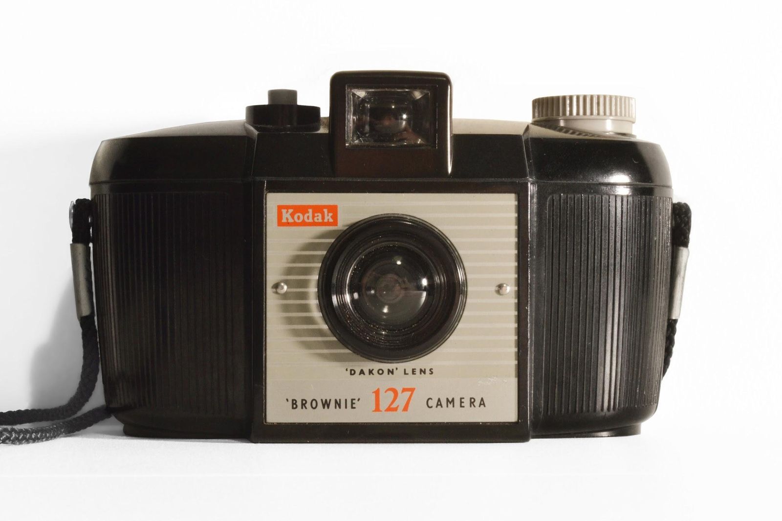
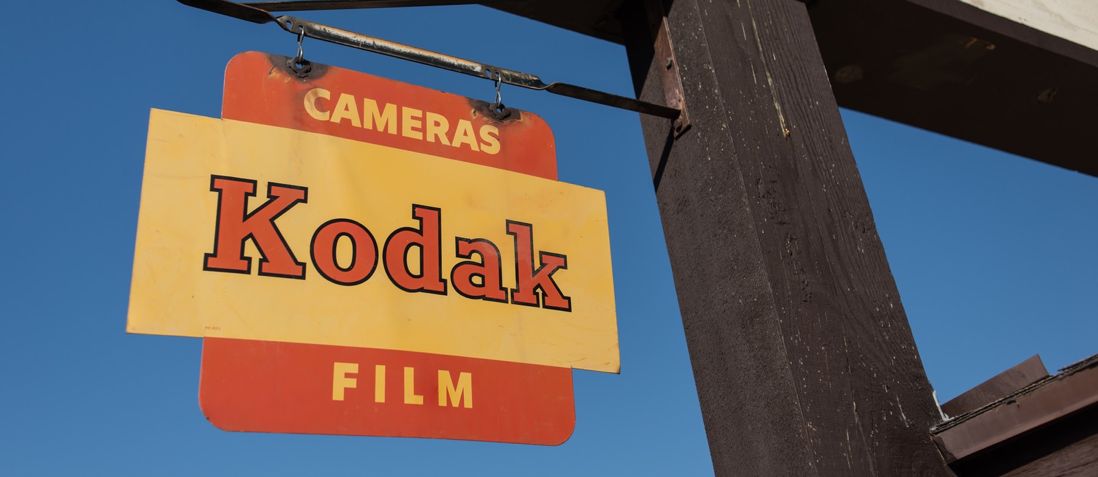
Back in the day, almost every vacation, birthday, wedding, or holiday gathering seemed to include a Kodak camera, or at least a roll of Kodak film. Founded in 1881, Kodak helped keep the moments that filled family photo albums for generations.

From the 1960s through the 1990s, Kodak dominated the world of film and photography. But that success also made the company slow to accept that technology was changing. Ironically, Kodak helped invent one of the first digital cameras in 1975, yet it hesitated to embrace the future. By the 1990s and 2000s, digital cameras (and later camera phones) quickly replaced traditional film. In 2012, the company declared bankruptcy.

3
Pan Am

Image: Felix Goetting (GFDL 1.2 or GFDL 1.2), via Wikimedia Commons

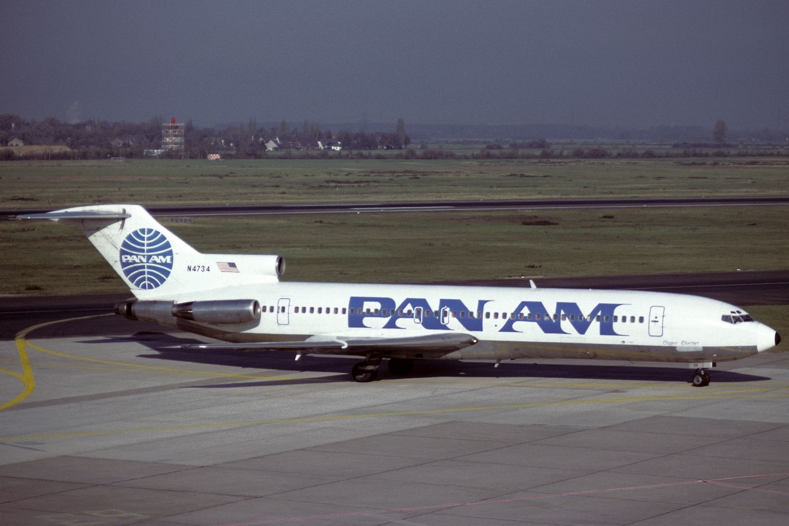
Long before flying became an everyday experience, Pan American World Airways, better known as Pan Am, was already carrying Americans across the world. It was founded in 1927, and during the 1960s and 1970s, the airline became a symbol of glamorous air travel.

Its famous blue globe logo was instantly recognizable, even to those who rarely flew. But by the late 1970s, rising competition, fuel costs, and financial troubles began weakening the company. After years of mounting losses and debt, Pan Am shut down in 1991. Even so, its fame was such that even today, more than 30 years later, we still remember it.

4
Woolworth’s

Image: Warren LeMay from Cullowhee, NC, United States, CC0, via Wikimedia Commons

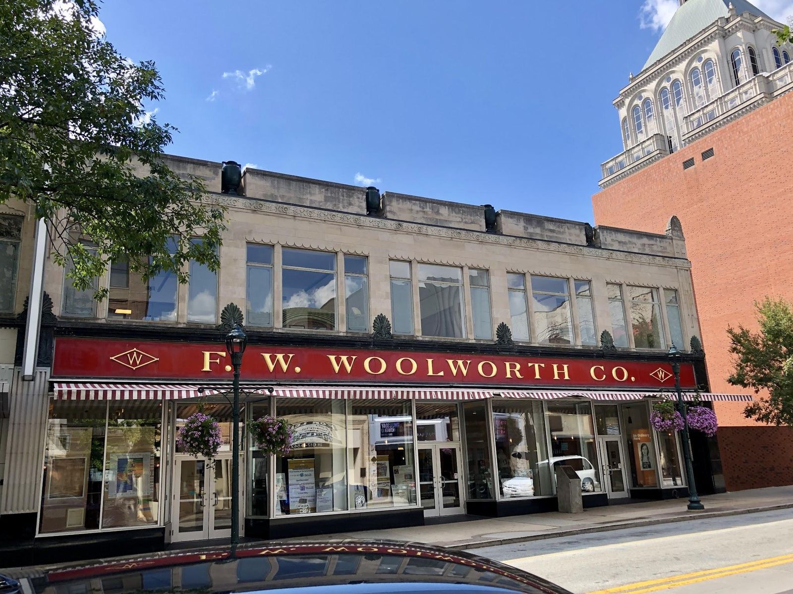
Before Woolworth's made the "five-and-dime" famous, shopping in America looked very different. For decades, Americans visited Woolworth’s for everything from toys and school supplies to household goods and everyday essentials. By the 1960s, the brand had become a familiar part of American life.

Created in 1879 by Frank Winfield Woolworth, the chain grew into one of the country’s largest retailers. But in the 1970s, malls and discount giants like Walmart changed the way Americans shopped, and Woolworth struggled to keep up. By the 1980s, the iconic chain was slowly disappearing. Most stores closed during the 1990s, and the Woolworth retail chain officially ended in 1997.

5
Circuit City

Image: kennejima, CC BY 2.0, via Wikimedia Commons

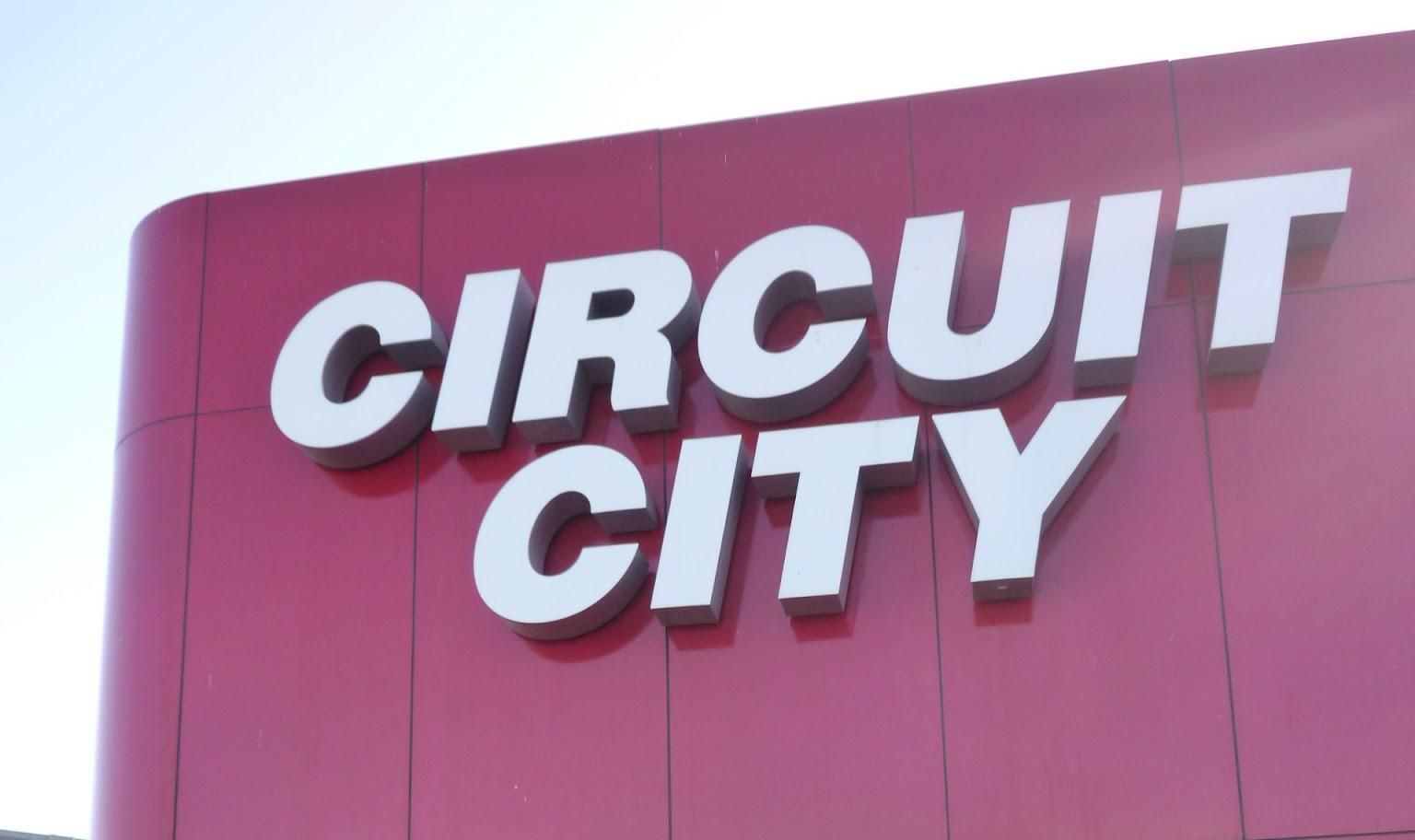
Testing giant stereo systems, browsing rows of CDs and video games, and shopping for the newest TV were all part of the experience at Circuit City, once one of America’s biggest electronics chains.

Founded in 1949 by Samuel S. Wurtzel in Richmond, Virginia, as "Wards Company," the retailer adopted the Circuit City name in 1984. During the 1980s, 1990s, and early 2000s, it became the go-to place for Americans buying a TV, stereo, computer, or any electronic device. But like many companies on this list, Circuit City struggled as shopping habits changed and online stores became more convenient. A controversial 2007 decision to lay off thousands of experienced employees further hurt the company’s reputation. Circuit City couldn’t survive mounting losses and closed all remaining stores in 2009.

6
Borders

Image: Bindydad123, CC BY-SA 4.0, via Wikimedia Commons

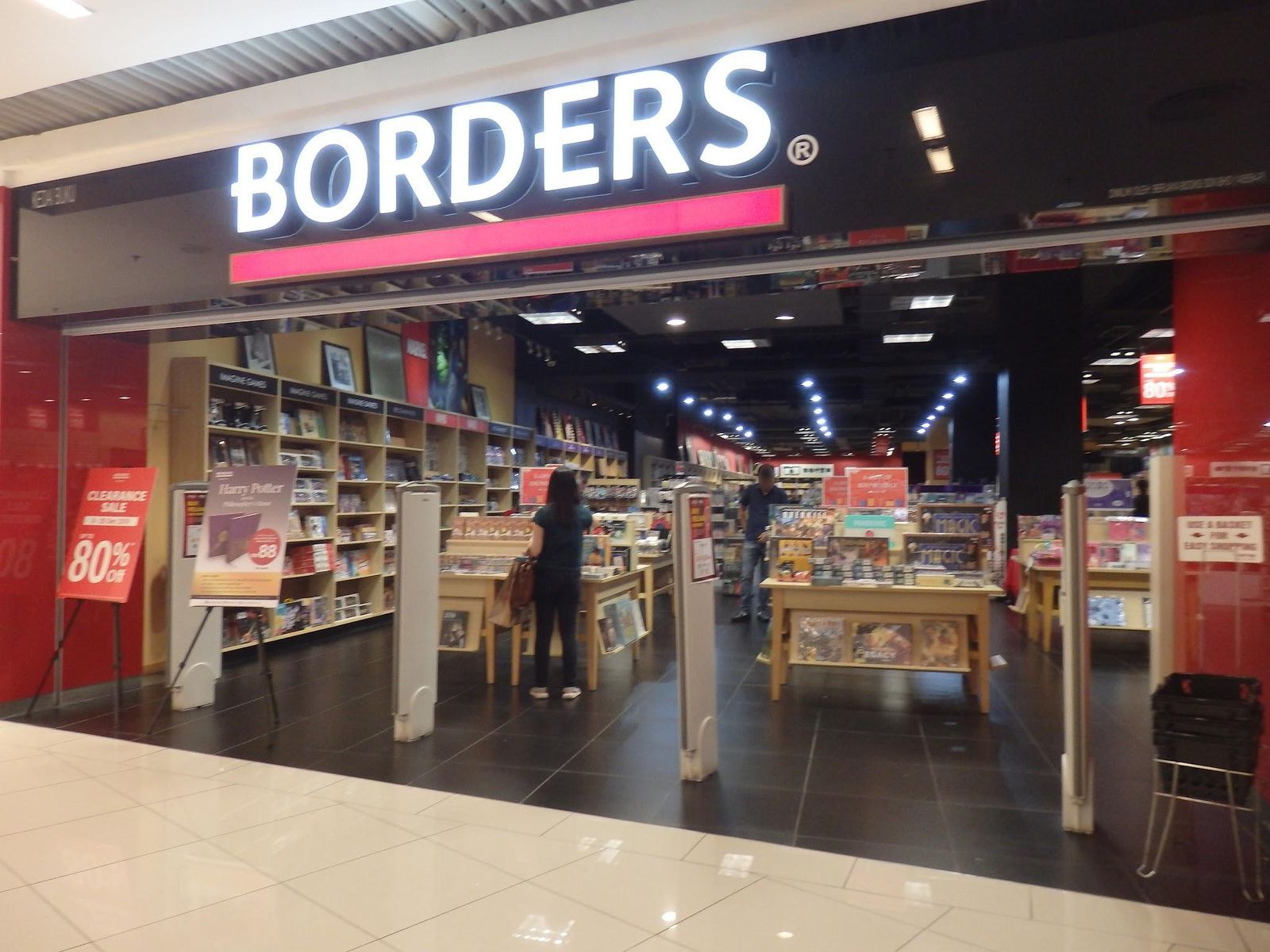
Remember Borders? Born in 1971, its huge stores, filled with books, music, magazines, and cozy reading spaces, invited customers to spend entire afternoons there.

During the 1990s and early 2000s, the rise of large shopping malls actually helped Borders thrive, turning its bookstores into popular destinations inside malls across the US. But eventually, the company ran into a challenge it couldn’t overcome: online shopping and digital reading. Competitors like Amazon surged ahead, while Borders struggled to adapt and made costly business decisions, including outsourcing its online sales to Amazon for years. The company collapsed financially in 2011 and soon closed all remaining stores.

7
Bugle Boy

Image: Claire Abdo

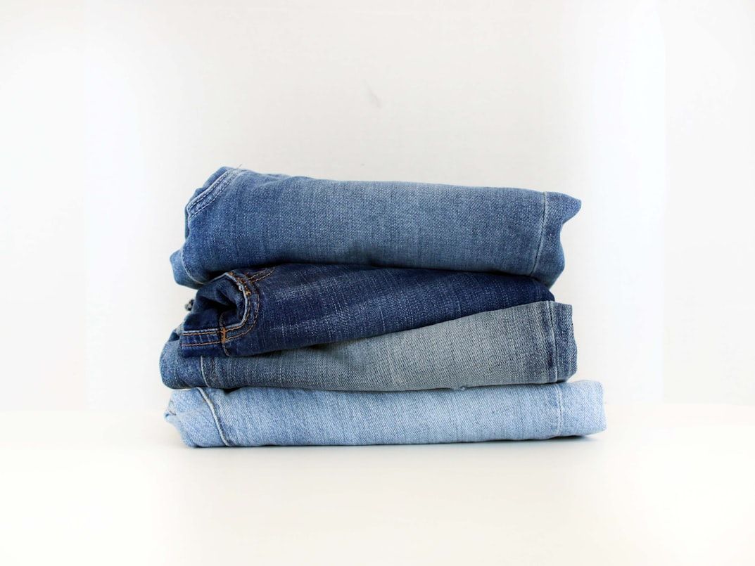
In the late 1980s and early 1990s, teenage fashion became almost synonymous with Bugle Boy. Famous across the country for its casual jeans and memorable TV commercials, the brand became a major part of American mall culture and was sold in department stores nationwide.

But fashion never stands still, and brands have to constantly adapt to survive. By the late 1990s, newer youth-oriented labels had taken over with fresh styles that quickly made Bugle Boy seem outdated. Sales began to fall, and after years of struggling to keep up with changing trends, the company closed its stores in 2001.

8
Howard Johnson’s restaurants

Image: Tichnor Quality Views, Made Only by Tichnor Bros., Inc., Boston, Mass., Public domain, via Wikimedia Commons

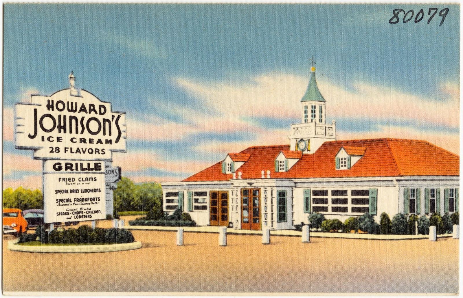
During the 1960s and 1970s, a stop at Howard Johnson's was part of the classic American road-trip experience for many families, and that was no accident.

Founded in 1925 in Quincy, Massachusetts, the famous orange-roofed chain reached its peak when America’s expanding highways and booming car culture made roadside travel more popular than ever. But by the late 1970s and early 1980s, the growing popularity of fast-food chains like McDonald's began changing the way Americans ate on the road. Drivers increasingly wanted meals that were faster, cheaper, and more standardized, while interstate highways also redirected traffic away from many older roadside locations. Unlike some other brands on this list, Howard Johnson’s faded away slowly over the decades. The last restaurant finally closed in 2022.

9
Burger Chef

Image: John Margolies, Public domain, via Wikimedia Commons

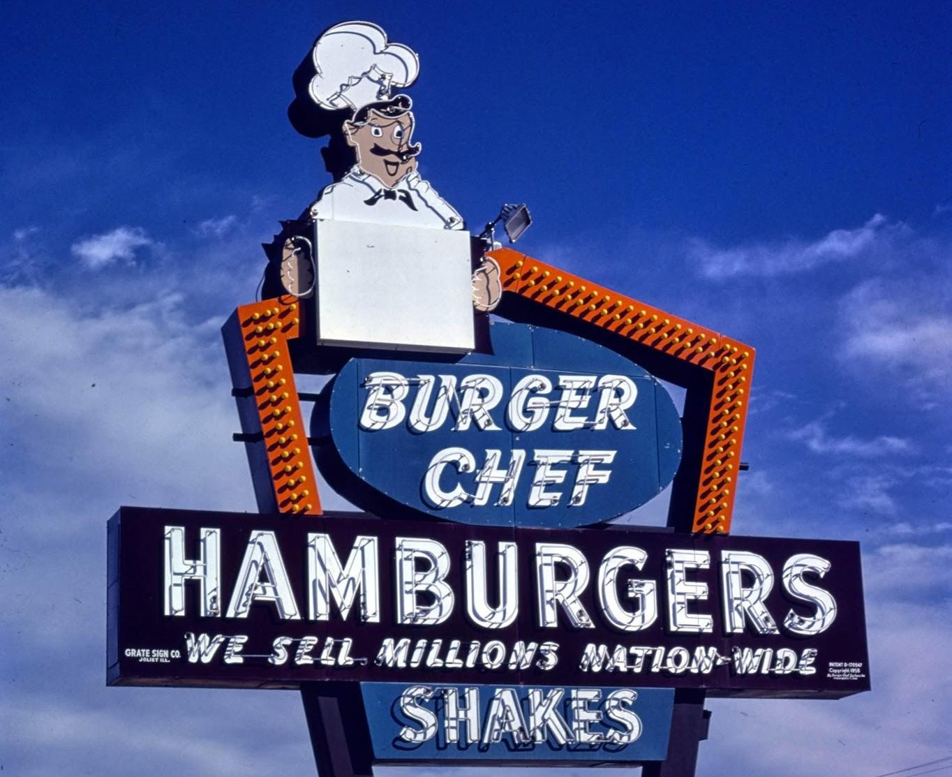
In 1958, a name emerged as one of the pioneers of America’s growing fast-food industry: Burger Chef. By the late 1960s, the chain had more than 1,000 locations across the country and had become one of McDonald's’s biggest competitors.

Long before Happy Meals became famous, Burger Chef helped popularize the idea of marketing meals directly to children with toys and themed publicity. But during the fast-food wars of the 1970s, competition became fiercer than ever. While McDonald’s and Burger King expanded by leaps and bounds, Burger Chef struggled with financial problems and changing consumer tastes. In 1982, the company was sold to Hardee's, which gradually converted most Burger Chef locations into Hardee’s restaurants.

10
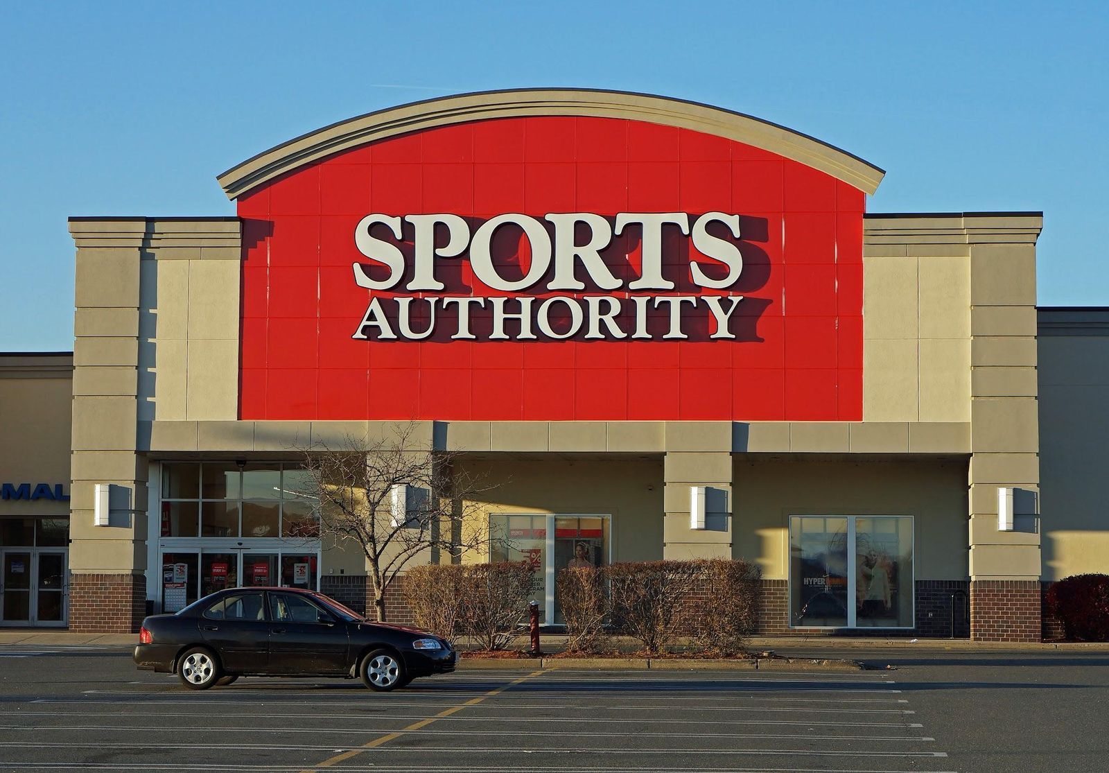
Sports Authority

Image: Anthony92931, CC BY-SA 3.0, via Wikimedia Commons

Throughout the 1990s and 2000s, many Americans looking for running shoes, gym shorts, and sports gear headed straight to Sports Authority.

Known for its huge stores packed with athletic apparel, exercise equipment, bicycles, camping gear, and team sports products, Sports Authority became the ideal shopping destination for families and athletes across the US. But as online shopping rapidly changed retail in the 2000s, the company struggled to adapt. Heavy debt from expansion efforts and a slow shift to e-commerce eventually caught up with the chain. Sports Authority declared bankruptcy in 2016 and closed all remaining stores later that year.

General General 4 min read

The secrets of the greenback

Dollar bills are green for this reason

Image: Pepi Stojanovski

The U.S. dollar is one of the most powerful and recognizable currencies in the world, but its physical form is unique for many other reasons . From its composition to its symbols, dollar bills and coins are carefully designed to combine history, security, and convenience. Let’s explore our national currency!

1
What are bills made of?

Image: Viacheslav Bublyk

Unlike other currencies, dollar bills are not made of paper or plastic. U.S. dollar bills are made from a special fabric blend composed of 75% cotton and 25% linen. This mix makes the bills extremely durable and resistant, and they can be folded about 4000 times before tearing.

2
What bills are valid?

Image: U. S. Government, The Bureau of Engraving and Printing, Public domain, via Wikimedia Commons

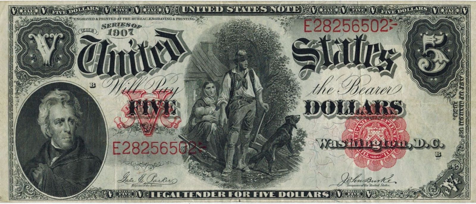
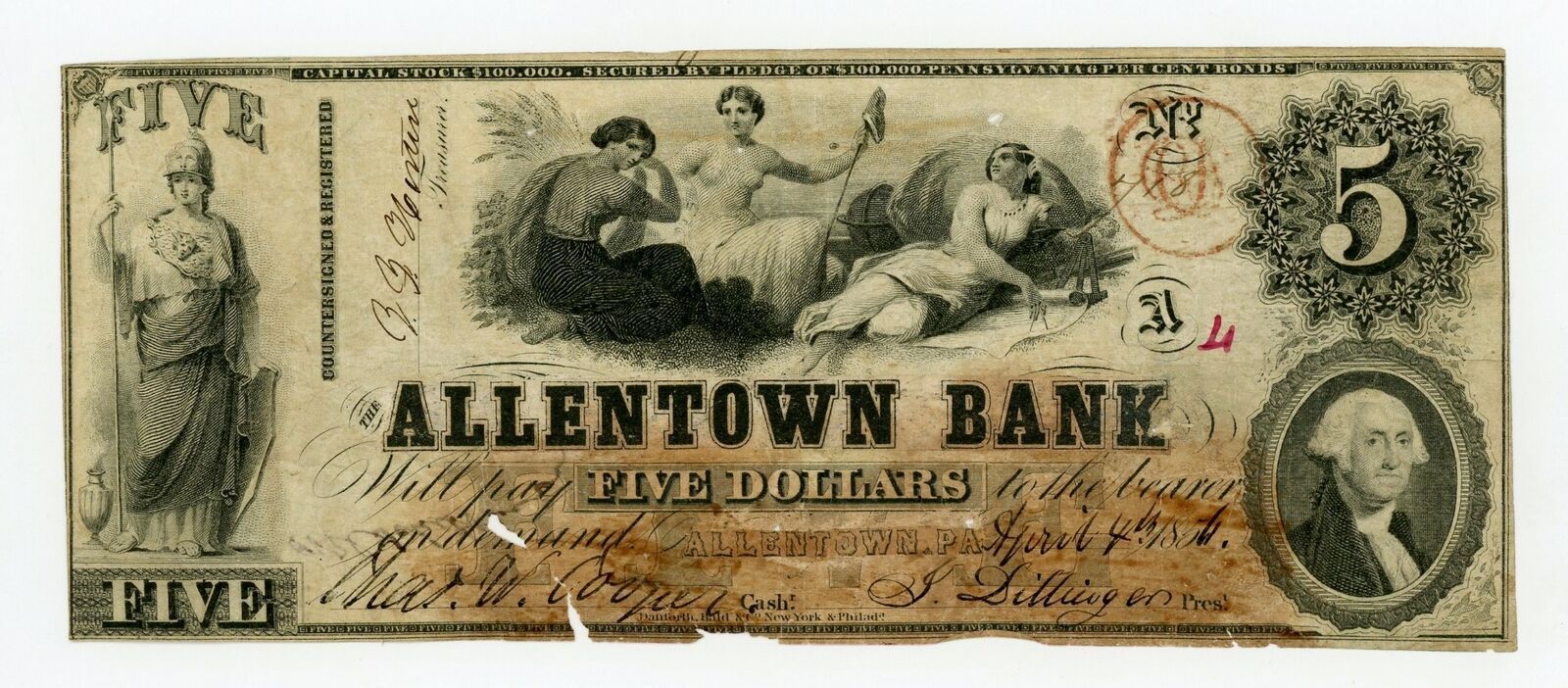
Any U.S. dollar bill that was legally printed is valid, no matter how old, as American currency does not have an expiration date. While some bills might not be accepted by businesses of foreign exchange services due to their condition or if they are a discontinued version of the bill, the bills themselves are still valid, and American banks will accept them, though they might take them out of circulation.

3
American leaders

Image: Lukasz Radziejewski

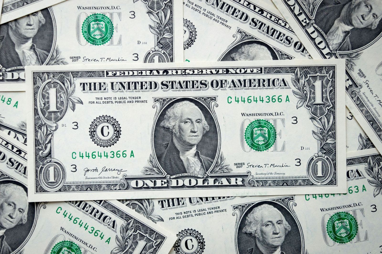
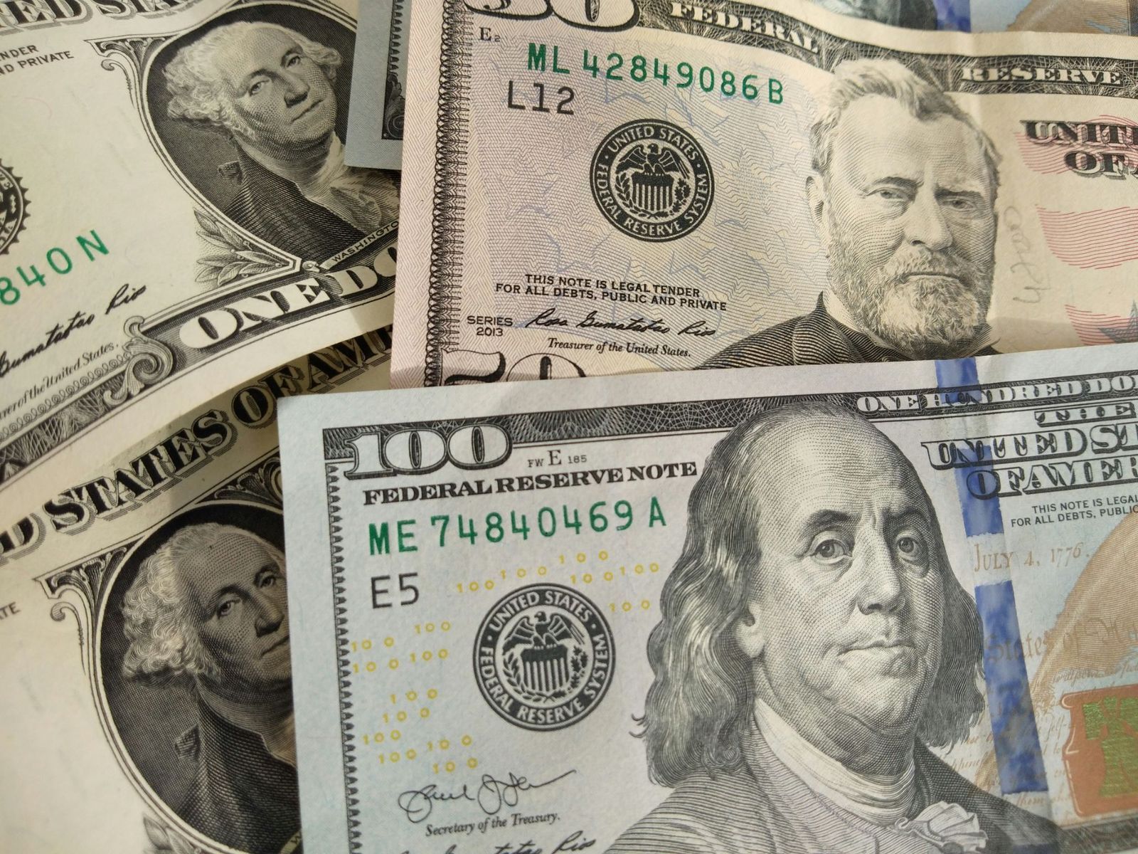
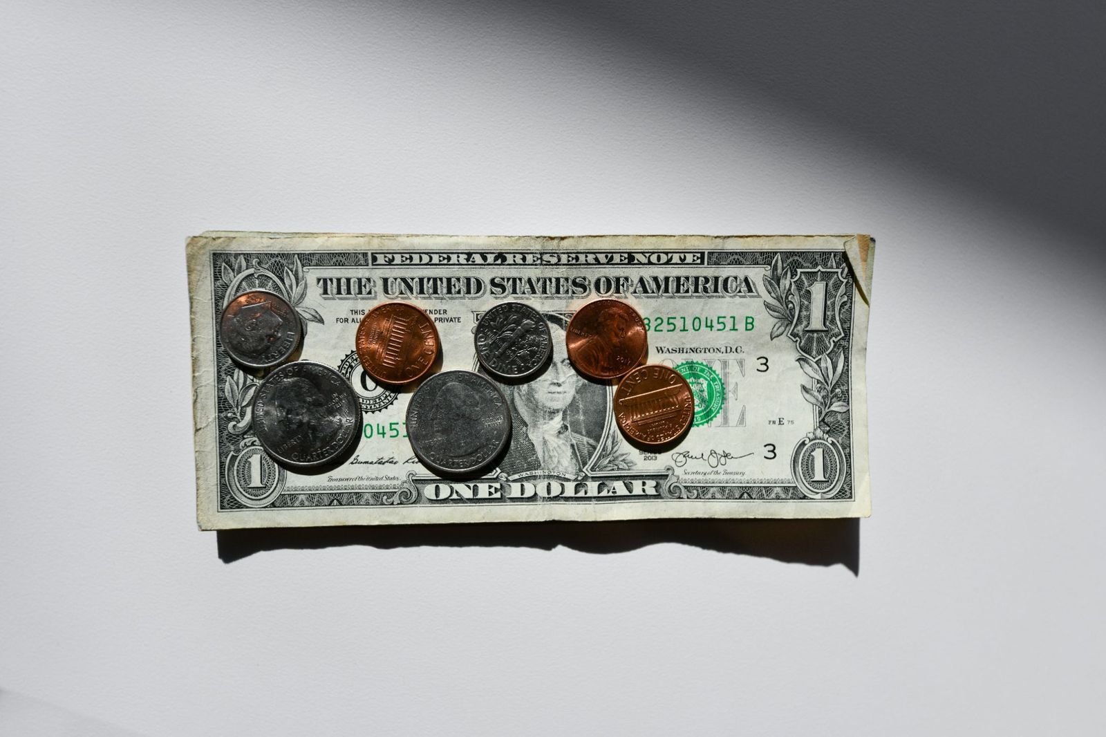
Five bills have a depiction of an American president. The exceptions are the $10 bill, with Alexander Hamilton on the front, and the $100 bill, with Benjamin Franklin. The $1 bill, depicting George Washington, is extremely symbolic: several elements are repeated 13 times as a nod to the thirteen colonies, and it showcases the Bald Eagle and the Eye of Providence as a sign of God watching over America.

4
A change in size

Did you know that dollar bills used to be so big that they were nicknamed "horse blankets"? Original dollar bills were 7.4 × 3.1 inches. In 1929, the Treasury Department reduced the size of bills to 6.14 × 2.61 inches to reduce production costs and materials. Old bills, though still valid, are worth much more as collector items.

5
Uniformity

Image: Avinash Kumar

Besides their value and design, all dollar bills have the same size (6.14 × 2.61 inches), color, and weight (1 gram) , which sets American currency apart from other countries where bills of different values are differentiated by size, color, or both. Why doesn’t the U.S. implement differences among bills? The cost of adapting vending machines, bank drawers, and ATMs to new bill sizes would cost billions of dollars.

6
Hard to copy

Image: United States Treasury Department, Public domain, via Wikimedia Commons

Originally, dollars were not green, but black. As time passed, green ink was favored, as it was cheap and did not fade as much as black. The new color also prevented people from using black-and-white cameras to create counterfeit money. Currently, dollar bills are predominantly green, but newer versions also include extra colors, such as pink, orange, or purple.

7
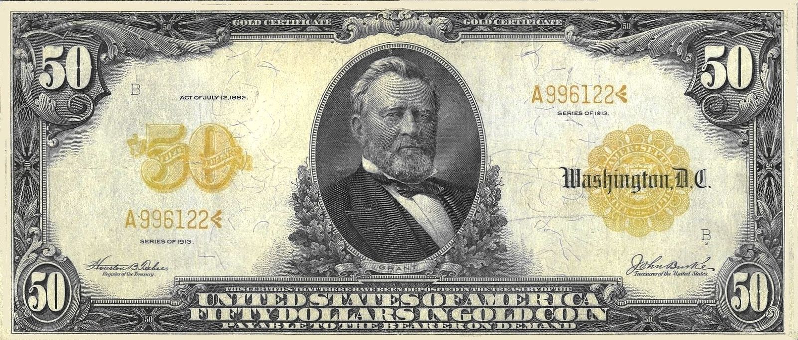
A $100,000 bill?

Image: The original uploader was Durova at English Wikipedia., Public domain, via Wikimedia Commons

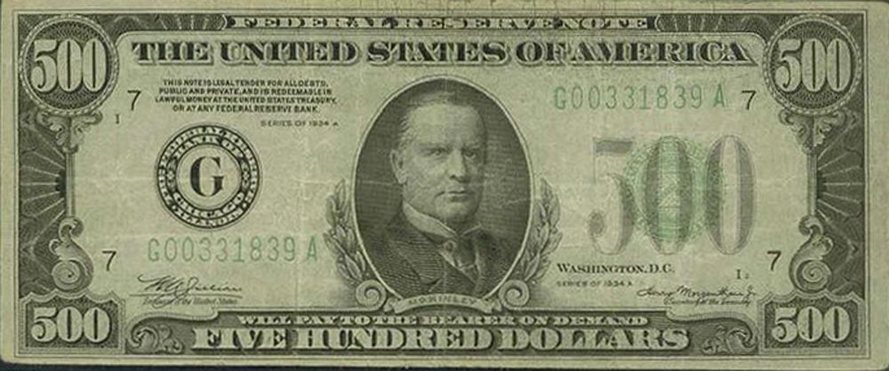
Have you ever seen a $500 or 1,000 dollar bill? What about a $100,000? Up until 1945, the U.S. Treasury printed $500, $1,000, $5,000, $10,000, and $100,000 notes , in addition to the values currently in use. These higher-value notes were mainly intended for bank and government use, but were sought by criminals as they made it easier to hide large amounts of money. Even though they were officially discontinued in 1969, these notes are still valid, though rare, and they have a high worth as collector's items.

8
No numbers

Image: Quilia

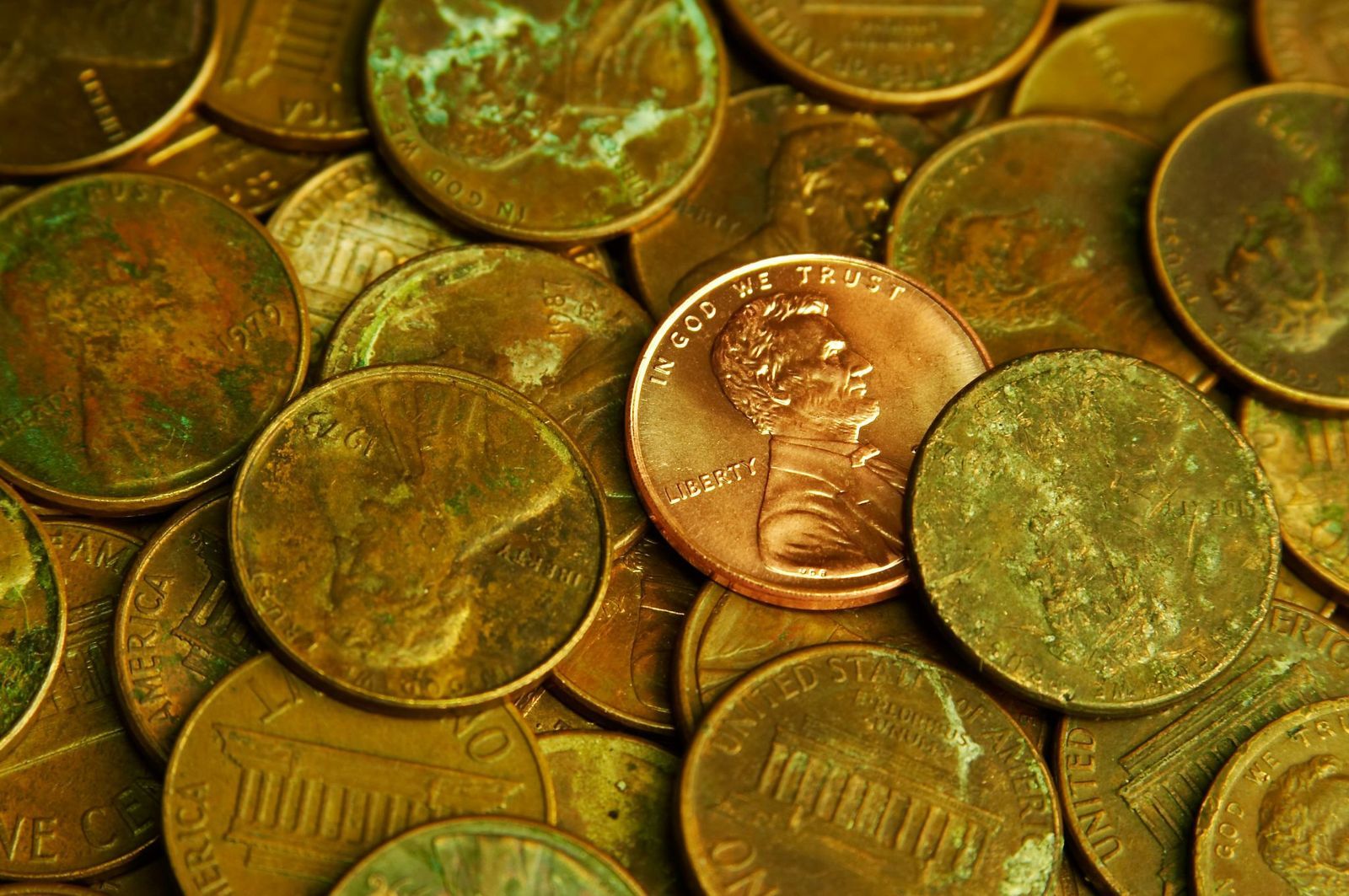
Unlike bills, American coins have different sizes and colors related to their value. Originally, gold, silver, and copper were used for coins, but modern coins are made of copper, zinc, or nickel. Besides their size and design, the value of each coin is printed in letters, not in numbers , alongside depictions of American presidents.

9
Liberty for all (the coins)

Image: Money Knack

By law, all American coins must include six specific details : the word ‘Liberty’, the name of our country, the national motto "In God We Trust", the oldest American motto "E Pluribus Unum", the value of the coin, and the year. Each coin also includes a mint mark that shows where it was made: "P" for Philadelphia, "D" for Denver, "S" for San Francisco, and "W" for West Point.

10
A global currency

Image: Logan Voss

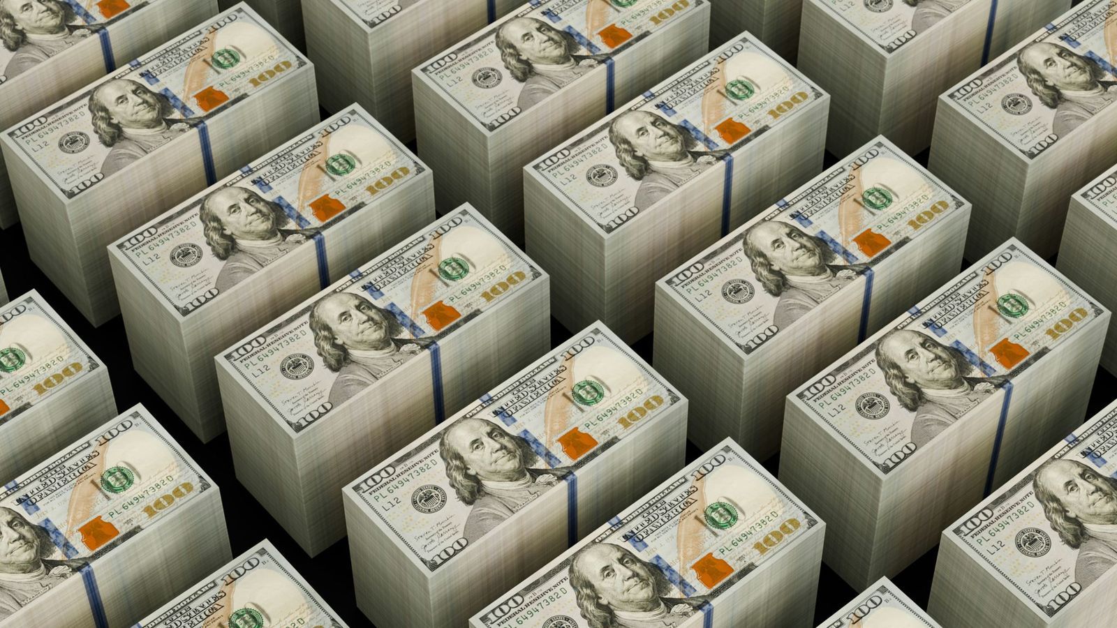
The American dollar is one of the most powerful currencies in the world, acting as a backbone for international trade and finances. It is estimated that two-thirds of the physical dollars in circulation are outside American territory. Besides the U.S. and its territories, eight sovereign nations have the U.S. dollar as their official currency, with several more accepting it as legal tender.

Explore more American facts

Choose your favorite category!

General
General

As American as apple pie—the very best America has to offer!

Culture
Culture

Delve into the astounding richness of American lore.

Geography
Geography

Hop in and explore vast and diverse American landscapes.

History
History

Discover the key moments that shaped the United States.