Monocles and mottos: Meet the 12 most beloved commercial icons in history
Image: Rubaitul Azad
They have crashed through brick walls, debated car insurance in British accents, and convinced us that a monocle is the height of legume fashion. Mascots are more than just corporate logos; for many of us, they are the familiar faces of childhood and the icons of American pop culture. But do you know the real stories behind the faces? We’ve compiled the ultimate list of the characters that defined American advertising history. Keep reading to see if your favorite character made the list!
1
Chester Cheetah
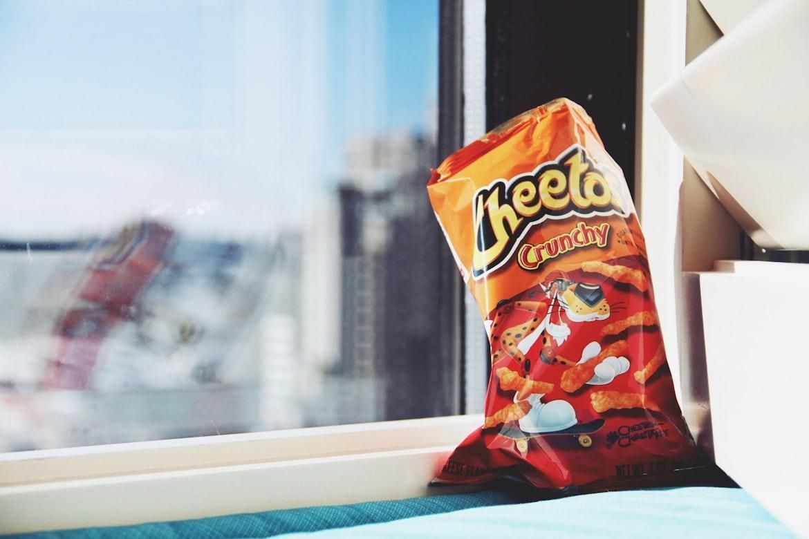
Image: Giorgio Trovato
Chester Cheetah joined Cheetos marketing in 1986 with a stylized, sunglasses-wearing design that reflected the youth-focused advertising of the time. His orange fur, black spots, and exaggerated long limbs gave him a modern appearance that differed from the more conventional mascots used in earlier decades.
Often depicted in cartoon adventures trying to get Cheetos from others using his hip attitude and humor, Chester began appearing in licensed merchandise and even two video games released for major home consoles. These additional uses helped increase his presence outside television ads and made him familiar to a wider audience.
2
Tony the Tiger
Image: Sten Ritterfeld
Tony the Tiger is probably one of children’s favorite mascots. Well, of course, he is gr-r-reat! Tony debuted in 1952 as part of Kellogg’s national push for its frosted cereal line. His early design resembled a traditional tiger on all fours, but by the 1960s, he was consistently illustrated standing upright. This adjustment to a more human-like figure made the character more attractive to children who started seeing him in print materials and television commercials. His striped orange coat and red scarf have remained stable features for decades, helping kids recognize the mascot across changing styles over the years.
3
Mr. Peanut
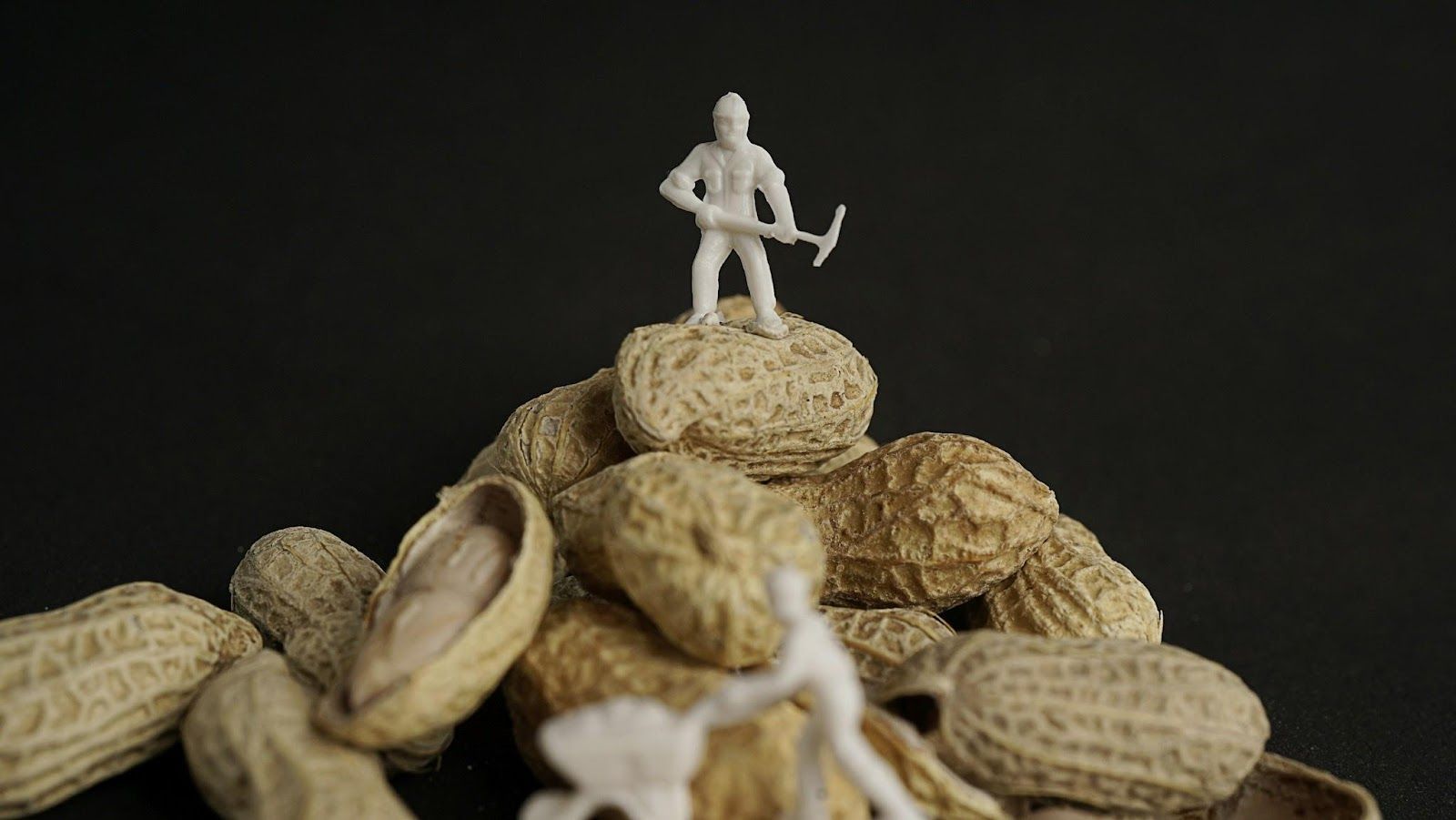
Image: Afif Ramdhasuma
Mr. Peanut entered American advertising as early as 1916, after Planters Nut & Chocolate Company held a public contest and selected a drawing submitted by a schoolboy from Virginia. The company later added the top hat, monocle, and cane, creating the formal look that became standard on packaging and billboards.
The suave, walking peanut we know and love appeared consistently in print ads and store displays, serving as a recognizable figure for the brand. During the mid-20th century, when packaged snacks and "gourmet" branding became more common in supermarkets, Mr. Peanut was used to reinforce the idea of a higher-quality product.
4
Colonel Sanders
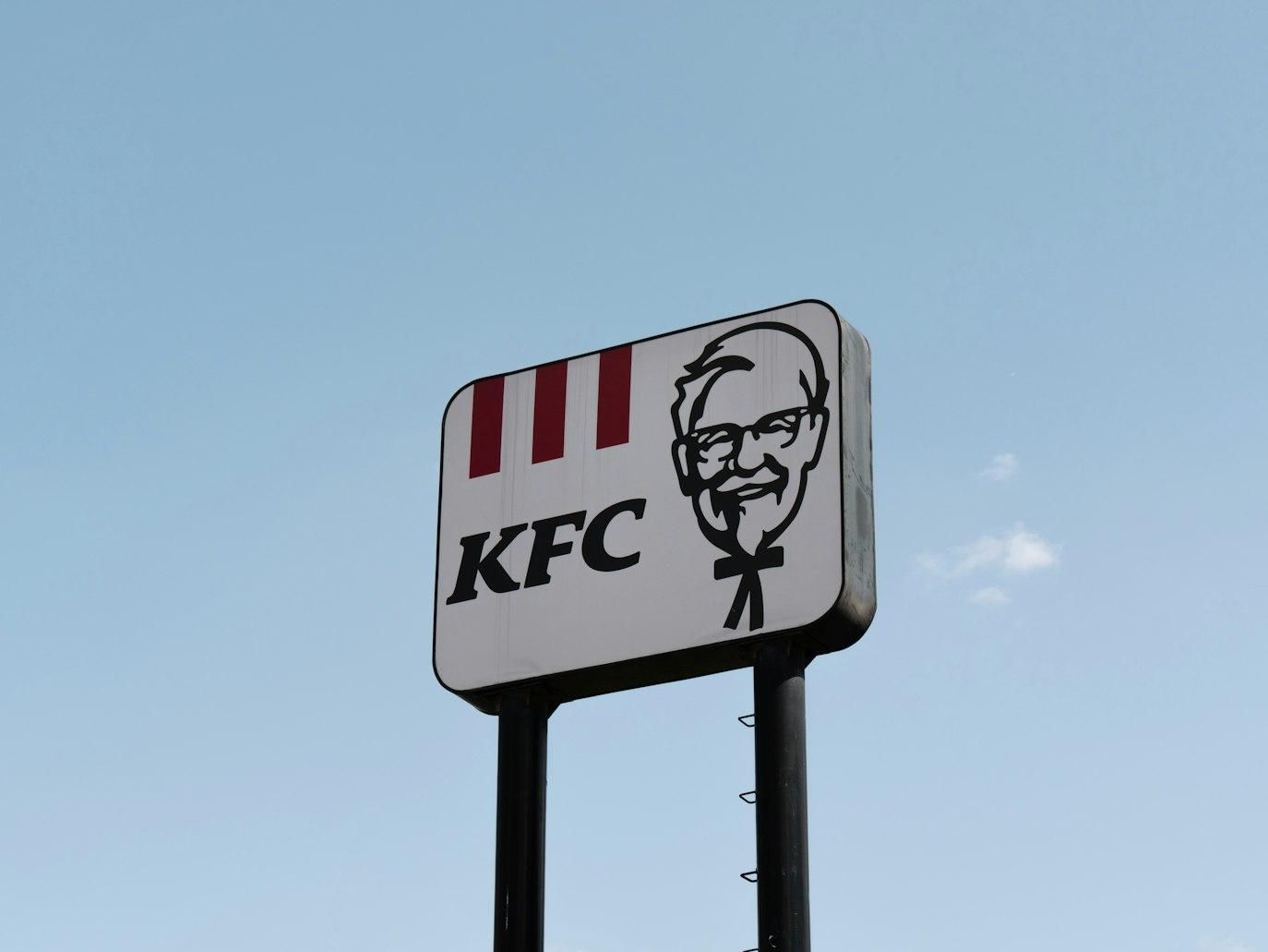
Image: He Junhui
In the 1950s, American entrepreneur Harland Sanders became the public face of his restaurant chain, Kentucky Fried Chicken, taking part in promotional photos, interviews, and appearances that helped introduce the brand to a wider audience. His white suit and black string tie were items he regularly wore, and the company adopted them as key visual elements to create a consistent look for KFC.
By the 1960s, his image was used on signs, packaging, and national advertising, giving customers a familiar figure associated with the product. Unlike most mascots, his portrayal was based on a real person whose small roadside business had grown into a national treasure.
5
Pillsbury Doughboy
Image: Nikoloz Gachechiladze
The Pillsbury Doughboy was introduced in 1965 using stop-motion animation in his early commercials, a common technique for character advertising at the time. His soft white body, chef’s hat, and neckerchief became standard symbols in Pillsbury promotions beginning in the late 1960s.
During the 1970s, he appeared regularly on national television, helping advertise refrigerated dough products that were marketed as convenient options for home cooks. His role remained consistent across these campaigns, making him one of the brand’s most recognizable features.
6
The Kool-Aid Man

Image: Fotografía de Alimentos
In just a few years, this mascot evolved from a simple smiling pitcher to a whole pop culture icon. Oh yeah! The Kool-Aid Man’s first television appearances began in the 1970s, building on earlier print versions. His clear, rounded glass body and bright red interior were easy for children to recognize, and the short catchphrase became closely linked to the product.
During this period, he was featured regularly in Saturday-morning TV advertising and in-store promotions aimed at families. These campaigns emphasized Kool-Aid as an inexpensive, easy-to-prepare drink mix, thanks to a character that brings joy and fun, making sure people have a good time.
7
GEICO Gecko
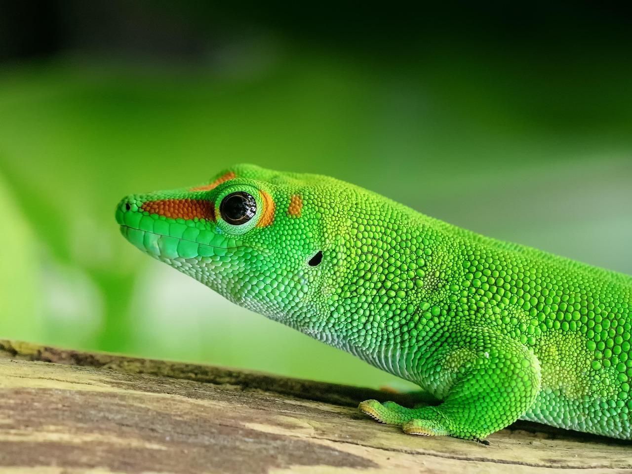
Image: moonzigg
Born after a 1999 SAG strike that limited live actors, the animated GEICO Gecko became a beloved, relatable brand ambassador who could present insurance information in a clear, approachable way. His small upright stance, green coloring, and British accent made him easy to identify and set him apart from the fast-paced commercials common at the time.
Over the years, he became a regular presence in campaigns that explained discounts, policy options, and general coverage details. His continued use across national TV, radio, and online platforms helped establish him as one of the brand’s most recognizable marketing tools. Can you quote his famous catchphrase?
8
Energizer Bunny
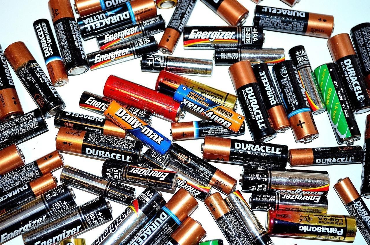
Image: PublicDomainPictures
Did you know the Energizer Bunny is actually a parody of the Duracell Bunny? Premiering in 1989, a year later than its main competitor, the pink rabbit was shown wearing sunglasses and flip-flops and carrying a large bass drum.
Throughout the 1990s, the Energizer Bunny was featured in several parody-style spots that placed him inside mock versions of other commercials before he continued walking and drumming. His image became closely linked to Energizer batteries' long-lasting power, becoming a pop culture icon representing the endurance and tenacity of the American People.
9
Ronald McDonald
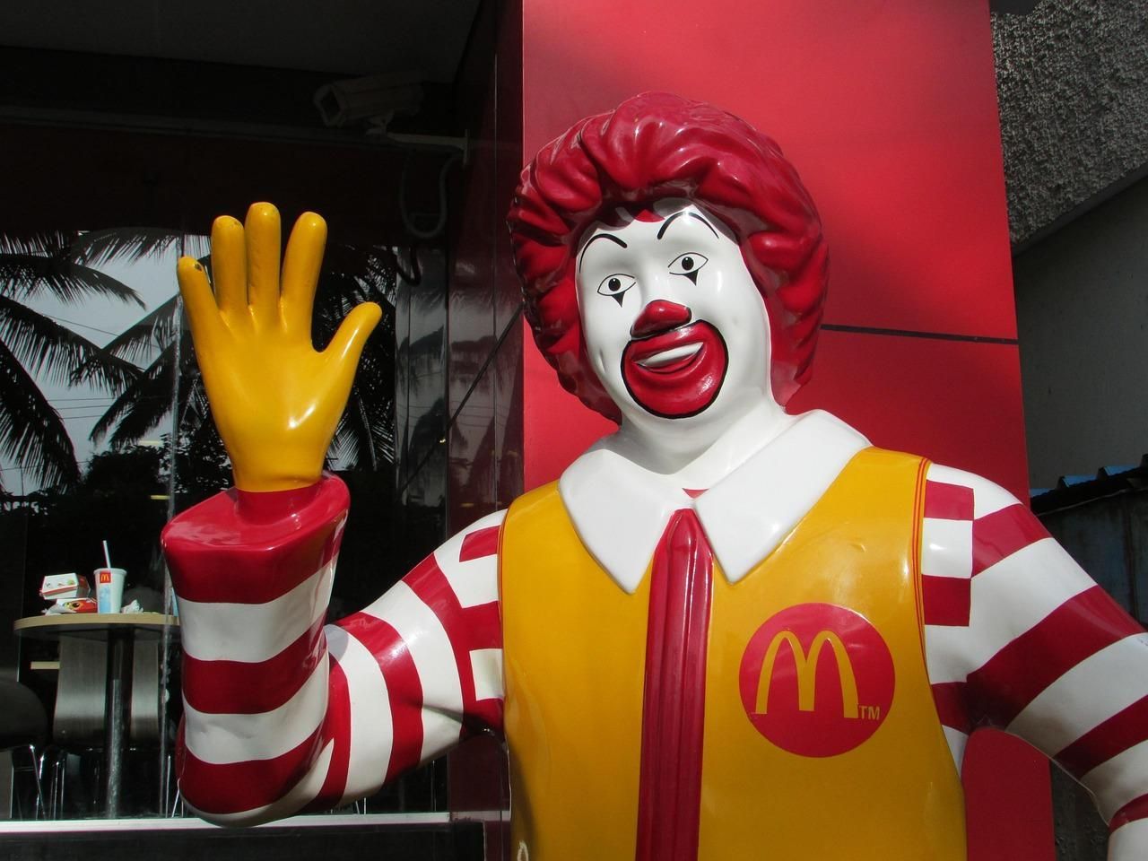
Image: Vijayanarasimha
Ronald McDonald is one of the most beloved characters among American children. He appeared nationally in 1963, adapted from earlier characters that had been used in local McDonald’s advertisements. With his red wig, white face makeup, and yellow jumpsuit, he lives in the magical McDonaldland with friends, representing fun and charity.
These key visual elements helped audiences recognize him instantly at store openings, public events, and televised commercials. From the 1960s through the 1980s, Ronald also participated in school visits and community programs that promoted basic safety messages and family-oriented activities. In just a few years, Ronald McDonald grew into a global icon that even inspired more characters synonymous with both fun and philanthropic missions .
10
Mr. Clean

Image: Anna Shvets
Who wouldn't trust a product promoted by a strong, reliable, muscular man? Introduced in 1958 and inspired by a U.S. Navy sailor, Mr. Clean appeared in packaging and commercials with his arms crossed and wearing a white T-shirt and a gold earring. His image, symbolizing powerful, effortless cleaning magic, helped shoppers to quickly recognize the product on crowded shelves.
The character’s straightforward design also aligned with a broader mid-century trend toward household products marketed as time-saving solutions. Over time, Mr. Clean continued to serve as a stable visual symbol for the brand’s focus on reliability and ease of use.
11
Betty Crocker
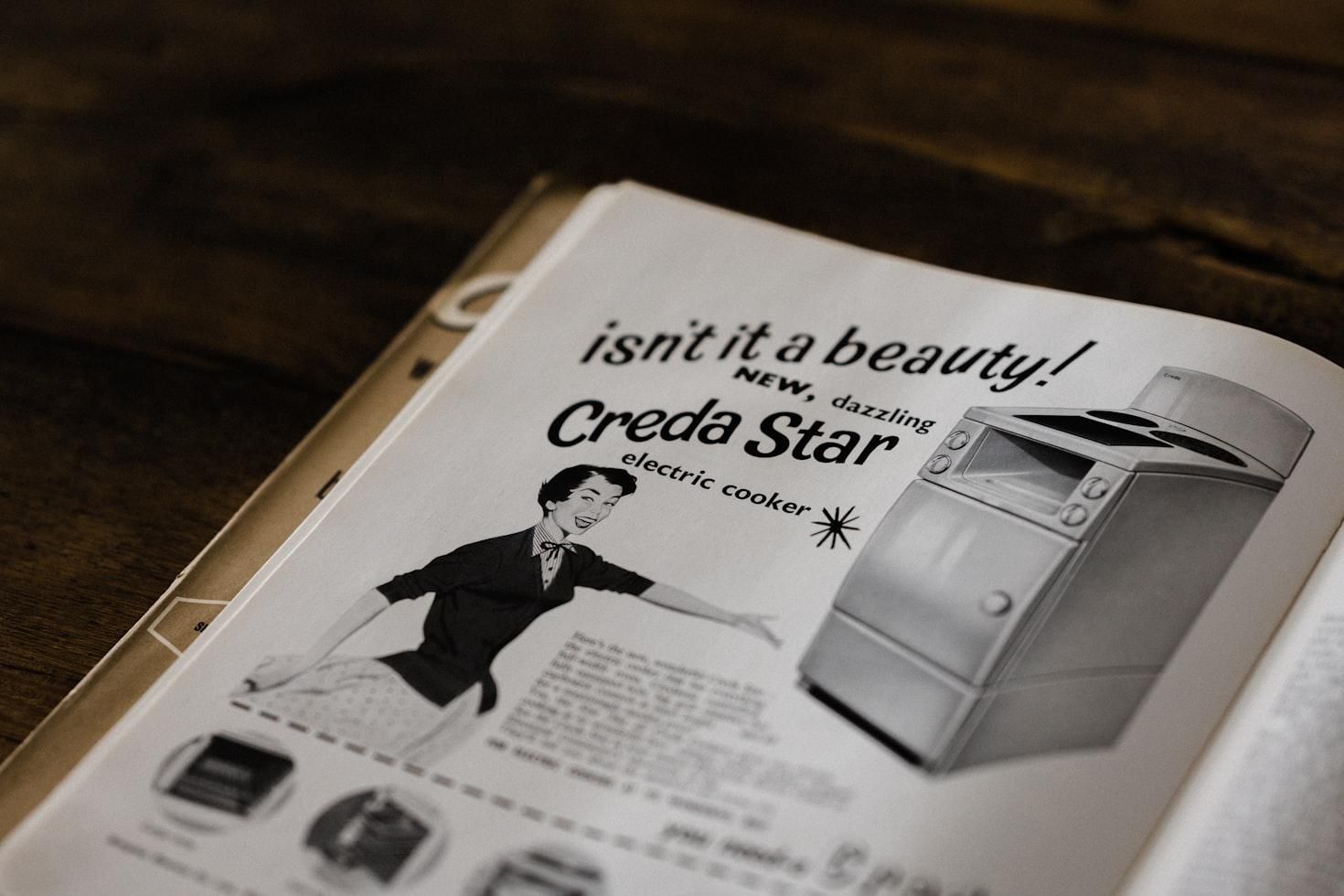
Image: Annie Spratt
Even more than a hundred years after her creation, Betty Crocker is still a beloved cultural icon representing home baking and American domesticity. She was first introduced in 1921 as a customer-response identity providing written answers to home-baking questions sent to the company. The name combined the friendly-sounding "Betty" with the surname of a retired company director, William G. Crocker.
She evolved from a voice on radio shows to the first portrait in 1936, which was repainted multiple times throughout the 20th century, and was adjusted to match changing American fashion while keeping the same general facial features. By the 1940s, she was widely recognized through cookbooks, recipe pamphlets, and radio guides that presented standardized instructions for home bakers.
12
"Rich Uncle" Pennybags
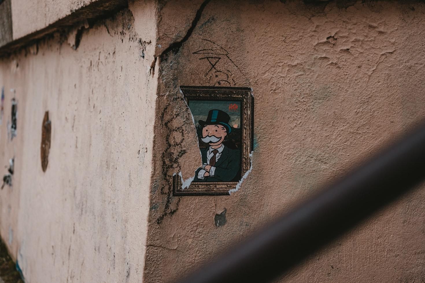
Image: Julian Hochgesang
Rich Uncle Pennybags is the mustachioed, top-hatted mascot of the Monopoly board game, a character designed to embody wealth and capitalism. His image, first introduced in 1936, was loosely based on Gilded Age tycoons like J.P. Morgan, which helped signal the game’s focus on property and finance.
When Monopoly grew in popularity and began distributing international editions in the 1970s, the mascot was added to rule books, game boxes, and licensed versions sold in different countries. Fun fact: Contrary to popular belief, Pennybags never wore a monocle. Think about that!