Necessary troublemakers
Meet 10 of the least favorite characters on American TV: Do you agree?

Image: Piotr Cichosz
We naturally cheer for the heroes in our favorite shows, but every great story needs a villain, a schemer, a troublemaker, or just a truly hateful character. Some of these are so cunning or exasperating that they become impossible to forget. Let’s take a look back at 10 iconic TV characters we love to hate.
1
J.R. Ewing (Dallas)

Image: Toglenn, CC BY-SA 3.0 <https://creativecommons.org/licenses/by-sa/3.0>, via Wikimedia Commons
If ambition had a face, it would probably be J.R. Ewing, the slick oil tycoon from the TV show Dallas . Manipulative, calculating, cold, incredibly greedy, and even treacherous, he checks all the boxes for one of TV’s most hated—and most memorable—villains.
2
Ross Geller (Friends)

Image: Philippe Berdalle, CC BY-SA 2.0 <https://creativecommons.org/licenses/by-sa/2.0>, via Wikimedia Commons
David Schwimmer brought to life one of the most memorable characters in American sitcoms. We’re talking about Ross Geller from Friends , a character who could easily land on both the "most beloved" and "most hated" lists. And that’s the charm of Ross: fans who adore him point to his generosity and intelligence, while those who can’t stand him blame his jealousy and tendency toward constant drama. Which side are you on?
3
Mr. Burns (The Simpsons)
Image: Erik Mclean
The millionaire Mr. Burns is the perfect example of a cartoon villain. And maybe it's not just his cold, calculating, and greedy nature that makes him so unlikable, but also his total inability to relate to or understand the problems of ordinary people. While it's hard to truly "hate" any character from The Simpsons , we can safely say he does not exactly inspire affection.
4
Kimmy Gibbler (Full House)
Image: Jason Leung
Kimmy Gibbler, played by Andrea Barber on Full House , is one of those characters who sparks mixed feelings. Some viewers find her loud, quirky, and intrusive behavior charming. However, for others, those same traits can be a bit too irritating. Whether you adore her or can’t stand her, no one could imagine the show without Kimmy.
5
Janice (Friends)

Image: Chester from Toronto, Canada, CC BY 2.0 <https://creativecommons.org/licenses/by/2.0>, via Wikimedia Commons
Those of us who watched Friends need just three words to remember this character: "Oh. My. God!" That’s Janice's trademark line, repeated almost every time she appears on the show. It’s not malice that gets under our skin, but her shrill voice, endless energy, and constant drama. And of course, she won’t leave Chandler alone, who does everything but be upfront about his feelings.
6
Livia Soprano (The Sopranos)
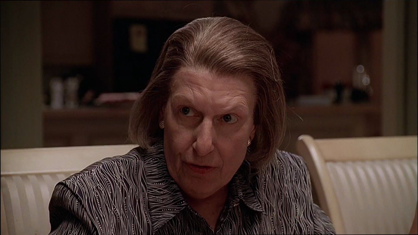
Image: HBO, CC BY 3.0 <https://creativecommons.org/licenses/by/3.0>, via Wikimedia Commons
Livia Soprano, mother of none other than Tony Soprano, manages to make us hate her from the very first season, and that’s part of what makes her such a compelling character. Bitter, cold, distrustful, manipulative, and calculating, Livia helps explain much of the protagonist’s behavior; through her, we glimpse the roots of Tony’s twisted mind.
7
Pete Campbell (Mad Men)

Image: Peabody Awards, CC BY 2.0 <https://creativecommons.org/licenses/by/2.0>, via Wikimedia Commons
Arrogant, manipulative, and always chasing status, these traits make Pete Campbell, played by Vincent Kartheiser, one of the least favorite characters on the iconic Mad Men . His hypocrisy and relentless ambition often lead him to overlook ethics and empathy, which is exactly why he earns a spot on this list.
8
Negan (The Walking Dead)

Image: Gage Skidmore from Peoria, AZ, United States of America, CC BY-SA 2.0 <https://creativecommons.org/licenses/by-sa/2.0>, via Wikimedia Commons
A villain so terrifying that he earns the hatred of viewers definitely deserves a spot on this list. We’re talking about Negan, the ruthless leader played by Jeffrey Dean Morgan on The Walking Dead . His brutality, arrogance, and need to control everything make him one of the show’s most frightening and unforgettable antagonists.
9
Nellie Bertram (The Office)
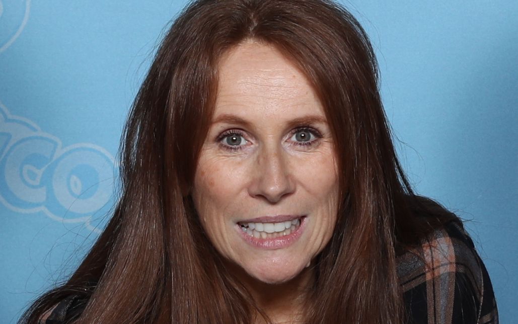
Image: Super Festivals, CC BY 2.0 <https://creativecommons.org/licenses/by/2.0>, via Wikimedia Commons
Played by the iconic Catherine Tate, Nellie Bertram joins The Office in the finale of the seventh season, and her excessive arrogance and pushy personality quickly make her one of the most irritating characters on the show. However, we have to admit it: on The Office , even the characters who get on our nerves often manage to make us laugh out loud.
10
Connor Roy (Succession)

Image: Super Festivals, CC BY 2.0 <https://creativecommons.org/licenses/by/2.0>, via Wikimedia Commons
A mix of wealth, eccentricity, vanity, greed, and a misplaced sense of power make Connor, the eldest Roy sibling in Succession , one of the least favorite characters in the series. His habit of taking advantage of others and expecting rewards he hasn’t earned is one of the key reasons he lands on this list.


