General General 3 min read

Your garden, your rules

12 common garden pests in the U.S. and how to control them

Image: Anna Shvets / Igor Son

Even on the smallest possible scale, nature is wild, and garden pests are a clear expression of that reality. Holes in leaves, small grubs around the roots of container plants, speckled foliage, and skeletonized leaves are just a few signs that pests may be present in your garden.

Check your plants often, and act quickly as soon as you spot a problem. Your garden will thank you!

1
Spotted and striped cucumber beetles

Image: Alexandria Szakacs

Striped and spotted cucumber beetles favor cucumbers and melon vines. These insects spread bacterial wilt from plant to plant, a disease that is often fatal. When striped cucumber beetles are a chronic problem, the best course of action is to choose bacterial-wilt-resistant cucumber varieties .

2
Colorado potato beetle

Image: Олександр К

As the name implies, the surest way to attract Colorado potato beetles to your garden is by planting potatoes. These insects lay clusters of orange-yellow eggs on the undersides of leaves, which hatch into highly destructive orange larvae that feed voraciously and grow quickly. While beetles can be killed at any stage, it's easiest to remove the adults and eggs by hand .

3
Eggplant flea beetle

Image: Weronika Romanowska

Eggplant flea beetles can destroy an eggplant plant in just a few days. While many insecticides can kill these pests, the most effective method requires protecting plants with summer-weight floating row covers. These covers transmit enough sunlight while physically blocking the beetles from the plants.

4
Harlequin cabbage bug

Image: David Clode

These insects might look striking, but they are the worst enemy of summer kale, broccoli, and other brassicas. They suck the sap from leaves, leaving behind unsightly pockmarks.

Harlequin cabbage bugs can be picked off by hand , and wearing a face mask can help you avoid the unpleasant odor they emit. Also, spraying them off with a jet of water will help knock them back.

5
Mexican bean beetle

Image: Viktor Talashuk

In a similar case to the one we mentioned earlier, it’s the larvae of Mexican bean beetles that cause the most damage. The adults emerge in late spring but usually don’t become a serious problem on bean plants until midsummer.

The best way to deal with this pest may seem harsh, but necessary if you want to keep your other plants safe: you must completely harvest and remove the infested plants from the garden . After picking all the beans, the entire plant should be pulled, bagged, and taken far away from the garden.

6
Red spider mites

Image: adege

Tiny red spider mites live on the undersides of leaves, where they feed on plant sap. To control them, the best approach is to increase humidity and, if growing under glass, introduce a biological control . Alternatively, organic sprays can also be effective.

7
Codling moth

Image: Mikkel Frimer-Rasmussen

These moths are responsible for the maggots found in apples. To avoid these, spray emerging caterpillars twice with bifenthrin , starting in midsummer. Another useful method involves hanging pheromone traps in late spring to catch male moths and prevent them from mating.

8
Winter moth

Image: Erik Karits

Winter moth caterpillars hide inside webbed leaves on fruit trees during the spring. One effective way to control these pests is by applying sticky traps to capture the adult moths before they lay eggs.

9
Scale insects

Image: efraimstochter

Scale insects cluster on branches and beneath leaves, often leading to poor plant growth. Other common symptoms include sticky excretions (called honeydew) and the development of sooty mold, especially on evergreens. The solution is to wash off the mold and spray the plant with horticultural oil .

10
Viburnum beetle

Image: Grant Ofstedahl

The Viburnum beetle and its larvae can create holes in the leaves. The answer to this is to spray the areas affected during the spring with bifenthrin or thiacloprid .

11
Adult vine weevil

Image: Henry Lai

The adult weevil is a nocturnal, flightless insect that makes notches in the leaves of your plants. To control this pest, apply nematodes by mixing them with water and applying the solution to the soil in the affected area.

12
Rose slug

Image: Naoki Suzuki

The rose slug is easy to overlook until its feeding starts to damage the leaves. Rose slugs feed on the undersides of leaves, out of sight, nibbling on the tissue between the veins. By the time they’re done, the leaves often resemble skeletons.

Luckily, the solution only requires blasting the slugs off the roses with a spray of water or treating them with spinosad, a bioinsecticide derived from soil bacteria.
Geography Geography 5 min read

Long-held misconceptions

Maine isn't where we thought it was, and 9 other truths about states

Image: Megan Clark

How can Canada be south of the United States? Is the Statue of Liberty really in New York? It turns out many of the "facts" Americans grew up learning in school aren’t completely true. From states that aren’t where you think they are to maps that wildly distort size and distance, these 10 geography myths will make you see the United States in a totally different way.

1
Where is the Statue of Liberty really located?

Image: Pierre Blaché

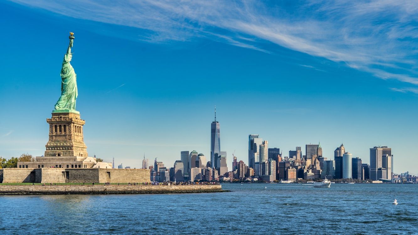
Most of us have always associated the Statue of Liberty with New York City. It’s on postcards, movies, souvenirs, and more. But technically, the famous statue stands in New Jersey’s waters.

The statue itself sits on Liberty Island, which legally belongs to New York, even though it’s actually closer to Jersey City than to Manhattan. Under an 1834 agreement between the two states, New York kept ownership of Liberty and Ellis Islands, while New Jersey retained control of the surrounding waters. So while the Statue of Liberty is officially New York property, it’s technically sitting on New Jersey’s side, something that still surprises many Americans today.

2
Canada is not always north

Image: Floris Siegers

Because of the way maps have always looked to us, most Americans grow up thinking you always have to travel north to reach Canada; we even call it "our neighbor to the north." For almost everyone, that’s true… except the people in Detroit, Michigan.

Thanks to the curve of the Detroit River and the city’s unusual location, the Canadian city of Windsor actually sits south of Detroit. That means when drivers cross the bridge from Detroit into Canada, their compass literally points south, even though they’re entering "The Great White North."

3
Daylight Saving Time isn't for everyone

Image: stefan moertl

Most Americans are used to Daylight Saving Time: clocks move forward one hour on the second Sunday in March and back again on the first Sunday in November. But two "rebel" states refuse to follow the rest of the country.

We’re talking about Hawaii and Arizona, which stay on Standard Time year-round. Hawaii skips Daylight Saving Time because its tropical location means daylight hours barely change between summer and winter. Arizona, meanwhile (except for the Navajo Nation), stopped observing it in 1968 because of the state’s extreme desert heat. During a 1967 trial run, they found that an extra hour of evening sunlight actually increased energy use, so Arizona decided it simply wasn’t worth it.

4
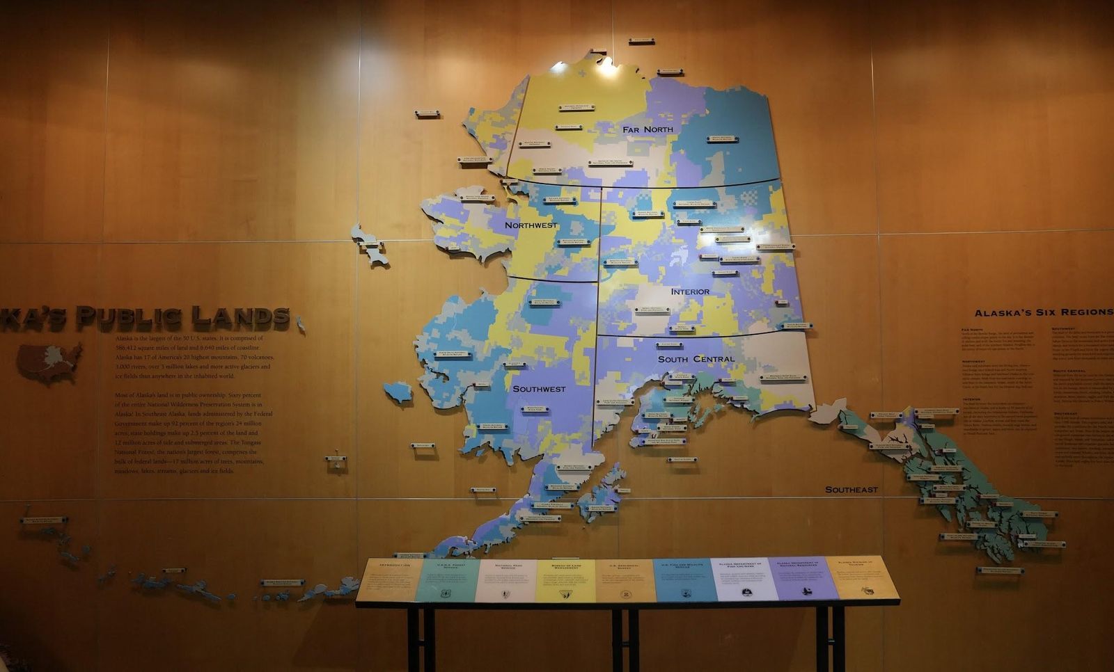
Maps distort Alaska

Image: Richard N Horne, CC BY-SA 4.0, via Wikimedia Commons

For generations, the maps hanging in American classrooms have tricked us about the true size of Alaska.

On many US maps, Alaska is squeezed into a small box in the corner, making it seem only slightly bigger than states like Texas or California. But the reality is shocking: Alaska covers about 663,300 square miles, making it so enormous that you could fit Texas, California, and Montana combined inside it. The distortion happens because flat maps shrink and compress distant areas to make them fit neatly on the page. In real life, though, "The Last Frontier" is far more vast than we think.

5
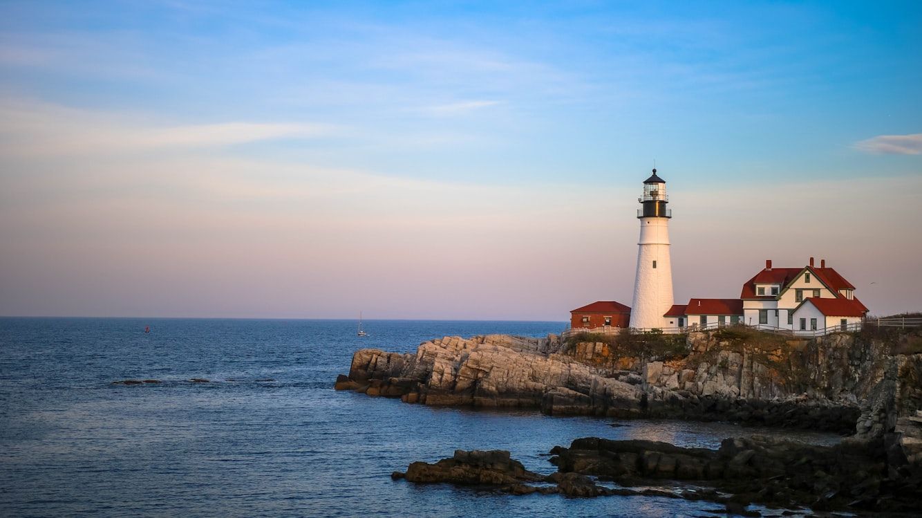
Maine is not located where we thought

Image: Mercedes Mehling

If someone asked, "Which is the easternmost US state?" most Americans would probably answer Maine without even thinking twice. But surprisingly, that’s not actually correct.

While it’s true that Maine is the easternmost state in the contiguous US, when all 50 states are included, the answer surprises many: the easternmost state is actually Alaska. How is that possible? It turns out that Alaska’s Aleutian Islands stretch so far west that they cross the 180th meridian into the Eastern Hemisphere, meaning part of Alaska is technically farther east than Maine.

6
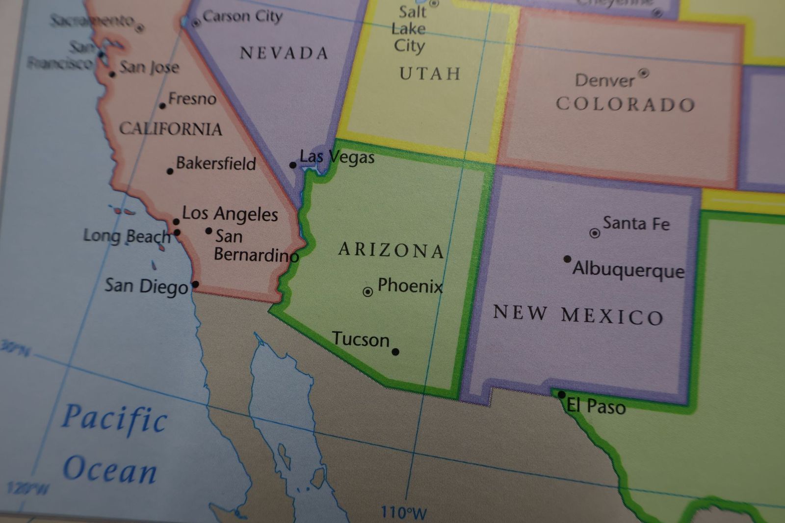
Is California always west of Nevada?

Image: shutterstock

If you were standing in California and needed to travel to Nevada, you’d probably assume you’d have to head east. But geography has a surprise here, too.

Believe it or not, Reno is actually about 86 miles farther west than Los Angeles. But how could a city in Nevada be farther west than a city on the Pacific coast? The answer is in California’s curved coastline. Because the coast bends inward so dramatically, Los Angeles sits farther east than most people realize, while Reno stretches surprisingly far west.

7
Not all deserts are hot

Image: shutterstock

When most Americans picture a desert, they imagine blazing sun and unbearable heat, but not all deserts in the US fit that image.

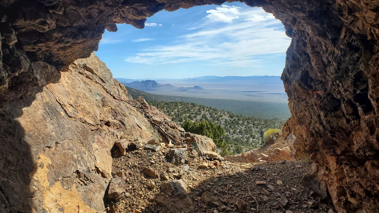
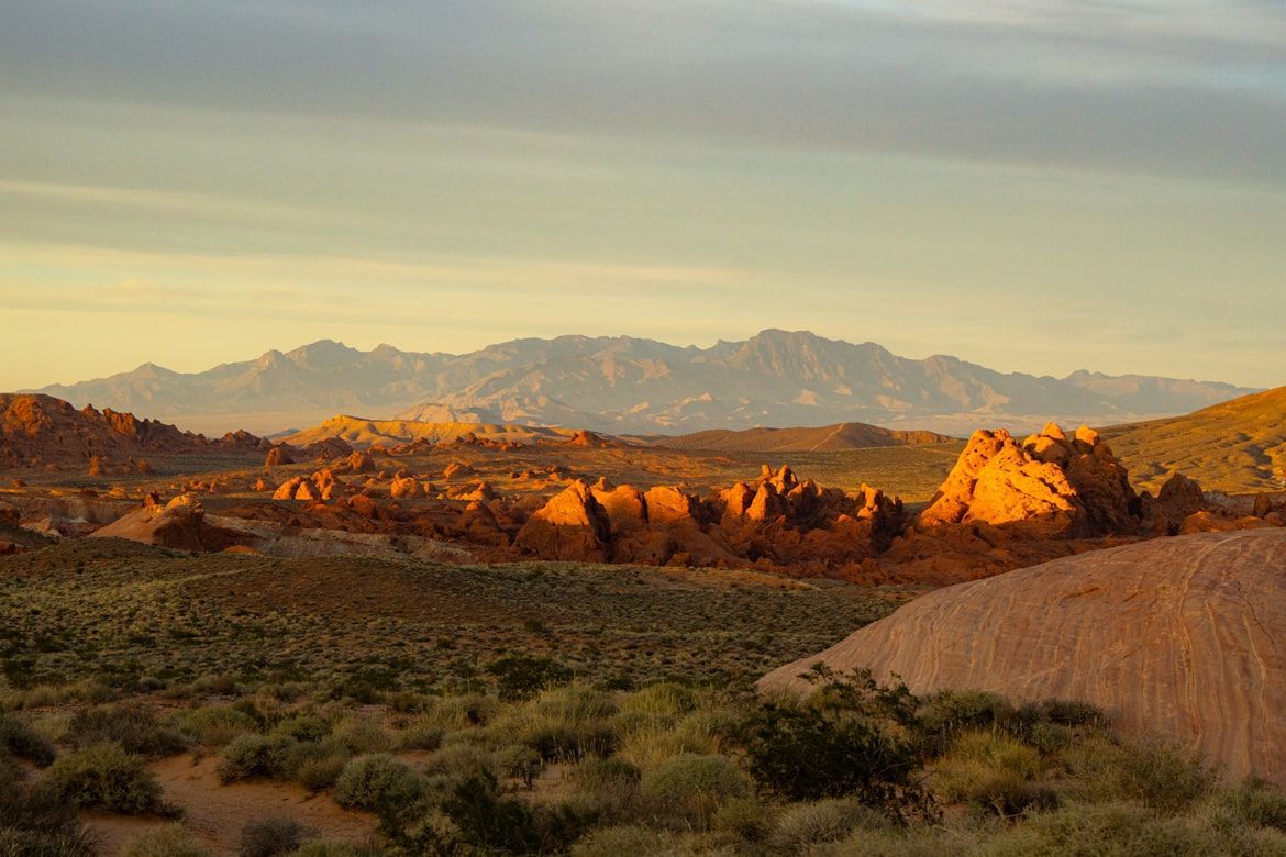
The huge Great Basin Desert, which stretches across much of Nevada and parts of Utah, California, Oregon, Idaho, and Wyoming, is classified as a cold desert. In fact, during winter, its temperatures can plunge below freezing, with heavy snowfall covering the landscape. The lowest official temperature ever recorded in the area was on January 8, 1937: an incredible -50 °F.

8
Almost all of the US is privately owned

Image: Yina Li

Many of us grew up assuming that most land in the United States is privately owned. And in much of the East, that idea is accurate. But for the West, the reality is different.

In the Western United States, about 47% of the land is owned by the federal government . And when you add state-owned land, the share of public land becomes even larger. Some states are especially striking: in Nevada, about 87% of the land is public, while in Utah, it’s around 75% .

9
The most populous state

Image: Luca Bravo

The incredible New York City is the most populous in the United States, with about 8.48 million residents, and there’s no doubt about that. Maybe that’s why many people naturally assume the state of New York is also the most populated, but it isn’t.

That distinction actually belongs to the state of California, with around 39.35 million residents , compared to roughly 20 million in New York state.

10
Which state is closest to Africa?

Image: Kristin Wilson

As we’ve seen, flat maps can distort how we think about distance and size. Because of that, many Americans assume Florida is the US state closest to Africa. But that’s actually not true.

Because of the Earth’s curvature, the US state closest to Africa is actually Maine. The northeastern tip at Quoddy Head is about 3,154 miles from El Beddouza, Morocco. By comparison, Florida’s eastern edge (around Singer Island) is roughly 4,085 miles from the African coast near Guerguerat, Western Sahara.

History History 5 min read

Marketing experts!

Can you see the arrow in the logo? 12 American brands' logos decoded!

Image: KelvinStuttard

Logos are everywhere: on billboards, coffee cups, your favorite gadgets—you name it! But how much attention do we really pay to the stories behind them? For example, did you know about the hidden arrow in the FedEx logo? And what about Tesla—is it just a T, or is there more to it? Big brands, big logos, big backstories —of course! Let’s take a fun dive into 12 iconic American brand logos and the hidden tales they tell.

1
Disney: A signature of magic

Image: Gui Avelar

Some logos inspire happiness at first glance, don’t you think? Walt Disney’s logo is a perfect example for us. It’s playful and inviting, and that’s because it’s modeled after Walt Disney’s very own signature, or at least an artistic version of it.

The truth is that Walt’s actual handwriting looked pretty different from the logo we know today because he changed his signature frequently, making it nearly impossible to determine if this version was ever truly his. In any case, it was very successful, and if you ask us, this logo screams "happily ever after."

2
McDonald’s: Golden arches or hidden symbol?

Image: Janet Ganbold

The moment you see a golden "M," your mouth starts watering, doesn’t it? However, the famous Golden Arches weren’t always part of McDonald’s logo history.

Back in the 1950s, they were part of the restaurant’s architecture, we mean actual arches on either side of the building!

When designing a logo, the company leaned into that imagery to create something unforgettable. Well, they definitely did it! And we’re lovin’ it!

3
Coca-Cola: Scripted for success

Image: Efekan Akyüz

That classic Coca-Cola logo has remained surprisingly consistent since 1887. The secret? A font called Spencerian Script, which was highly fashionable back in the late 19th century.

The smooth, flowing letters give it a friendly, approachable feel, it’s like an invitation to "have a Coke and a smile."

Over the years, the brand played with design elements (remember the old glass bottles?), but the logo’s handwritten charm never wavered. The old-school way truly is the best way in some cases.

4
Dove: A symbol of softness

Image: Akshay Bandre

Some logos are so powerful, that you can almost taste them. In this case, you can smell and feel it at the same time. Have you ever noticed the graceful bird on Dove products? That dove isn’t just for show, it represents peace, gentleness, and care , which is exactly what the brand aims to evoke.

When Dove first launched in 1955, its messaging was all about moisturizing and being kind to your skin. The logo, paired with the brand’s soothing colors, reinforces that sense of softness. It’s one of those designs that just feels good, even before you try the products.

5
Amazon: The smile that points the way

Image: Christian Wiediger

The story behind the name is quite fascinating, but let’s focus on the logo. Amazon’s logo isn’t just a smile—it’s a smile with a purpose. Look closely, and you’ll notice the arrow stretches from "A" to "Z," symbolizing the company’s goal to offer everything you could ever need.

And that curved arrow? It’s designed to look like a grin, giving the brand a friendly, customer-first vibe. With a logo this clever, it’s no surprise they’ve grown into an online shopping powerhouse. This is the kind of logo we like—what about you?

6
Google: The colors of curiosity

Image: sarah b

At first glance, one might think Google just put together the letters, chose random colors, and launched the site. But that’s definitely not the case—this logo is packed with meaning.

To begin with, they are not random colors, they are primary colors, chosen to represent creativity and approachability .

As for the unexpected green "L," it’s a nod to the idea that Google likes to break the rules (in a good way, of course). Over the years, the company has refreshed the logo’s font and shading, but the vibe remains the same. And let’s not forget about the festive Doodles—they’re genius!

7
Starbucks: From the sea to your cup

Image: Athar Khan

That green mermaid on your Starbucks cup? She’s actually a two-tailed siren, inspired by an old Norse woodcut. Why a siren, you may ask? Well, the brand wanted to evoke the allure of coffee as something irresistible —like a siren’s call.

Over time, the logo has evolved, losing the "Starbucks Coffee" text to let the siren shine on her own. Curious enough, the first design included the name of the company on the outer part of the circle, but they decided to eliminate that and let the siren do all the luring work on her own!

8
FedEx: The arrow you didn’t see

Image: Jan Rosolino

FedEx has one of the sneakiest logos in the business world. Between the "E" and the "X," there’s a hidden arrow that represents speed and precision . And once you see it, you can’t unsee it!

This wasn’t the original version, though. Designed in 1994, the logo is a masterclass in subtlety and clever branding, much like Amazon’s. It’s a perfect fit for a company that prides itself on delivering packages quickly and efficiently.

9
Domino’s: Three dots, infinite pizza

Image: Miroslav Denkov

Speaking of logos you can taste, right? Domino’s logo features three dots, which represent the first three locations of the pizza chain .

Originally, the company planned to add a new dot for every store they opened. Can you imagine if they had kept that idea? They quickly realized that wouldn’t work with their explosive growth.

Paired with the iconic red and blue colors, the logo is as comforting as a fresh box of pizza. And let’s be real—who doesn’t love their pizza?

10
Tesla: An electric secret

Image: Tesla Fans Schweiz

Tesla’s sleek, futuristic logo isn’t just a fancy "T"; it’s actually a nod to the company’s cutting-edge tech. The "T" is designed to resemble a cross-section of an electric motor, tying into Tesla’s mission of revolutionizing transportation .

Pair that with its clean lines and modern vibe, and you’ll see that the logo feels as innovative as the cars themselves. It’s a perfect example of branding that matches the product: bold, forward-thinking, and undeniably cool. What do you think?

11
Levi’s: A stitch in time

Image: Mnz

Few pieces of clothing are as iconic as a pair of Levi’s, right? That’s because both the item and the logo are equally simple, bold, and instantly recognizable .

The classic red tab is the result of eight redesigns. The first version of the logo included two horses pulling in opposite directions of a pair of jeans, trying to rip them—and failing, of course! But that was just the beginning.

The logo we know today was introduced by the same designer who worked on Coca-Cola’s script and the inspiration was the stitching on the back pocket of the jeans. The rest, as they say, is comfortable and durable history!

12
Pepsi: A logo full of energy

Image: Ja San Miguel

This article comes to an end with a classic brand. Pepsi’s logo has gone through dozens of iterations, but the current design—a red, white, and blue globe—is packed with meaning.

The wavy lines represent energy and dynamism, while the patriotic colors nod to its American roots, naturally. And if you were doubtful that it represents our country, you can read the 27-page redesign manifesto from 2008, which reportedly cost millions and came with a full explanation of its symbolism!

Explore more American facts

Choose your favorite category!

General
General

As American as apple pie—the very best America has to offer!

Culture
Culture

Delve into the astounding richness of American lore.

Geography
Geography

Hop in and explore vast and diverse American landscapes.

History
History

Discover the key moments that shaped the United States.